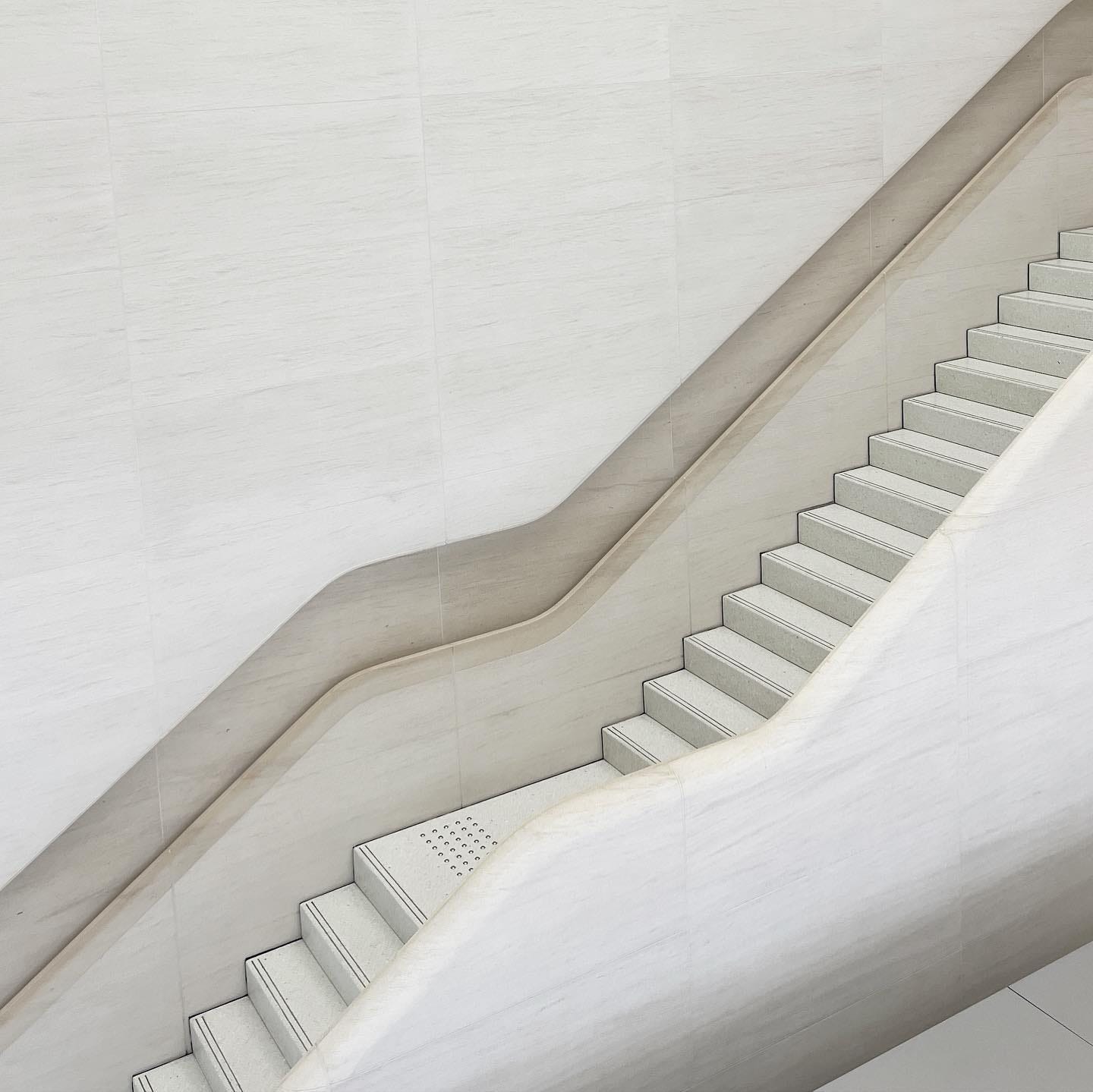
Apple Battersea opens
Apple's latest store design comes to the U.K.
Apple Battersea opened on Thursday in London. It’s the 40th Apple Store in the U.K. but only the second globally built with the latest design ideas.
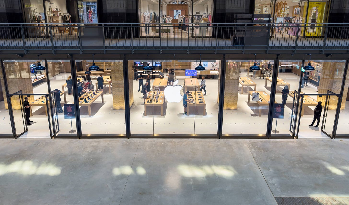
If Tysons Corner marked a new chapter, we’re now into the text. It’s fantastic to produce one store, but universal design principles must be pliable enough to work in virtually any environment and layout. Apple Battersea is a proving ground.
Battersea Power Station is a Grade II* listed building. It’s a classification that, similar to the U.S. National Register of Historic Places, makes the structure culturally notable and worthy of historic protection. Though the station’s been renovated with retail and office space, it still contains many original elements. Preservation raises some additional design challenges, and Apple met the task with a solution I haven’t seen before.
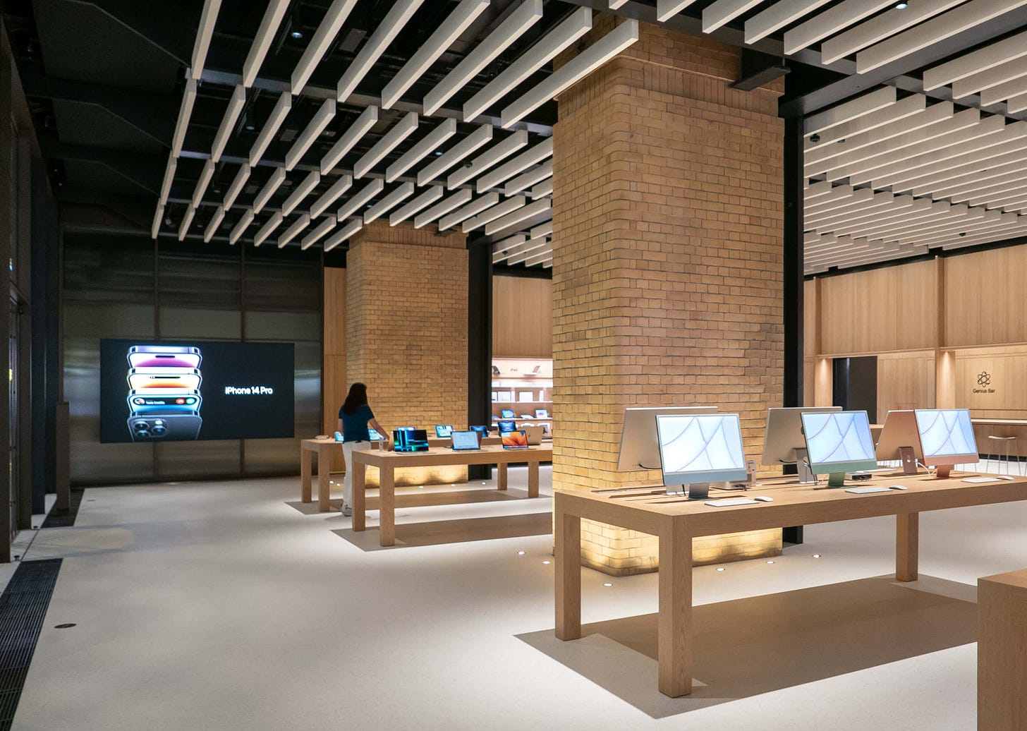
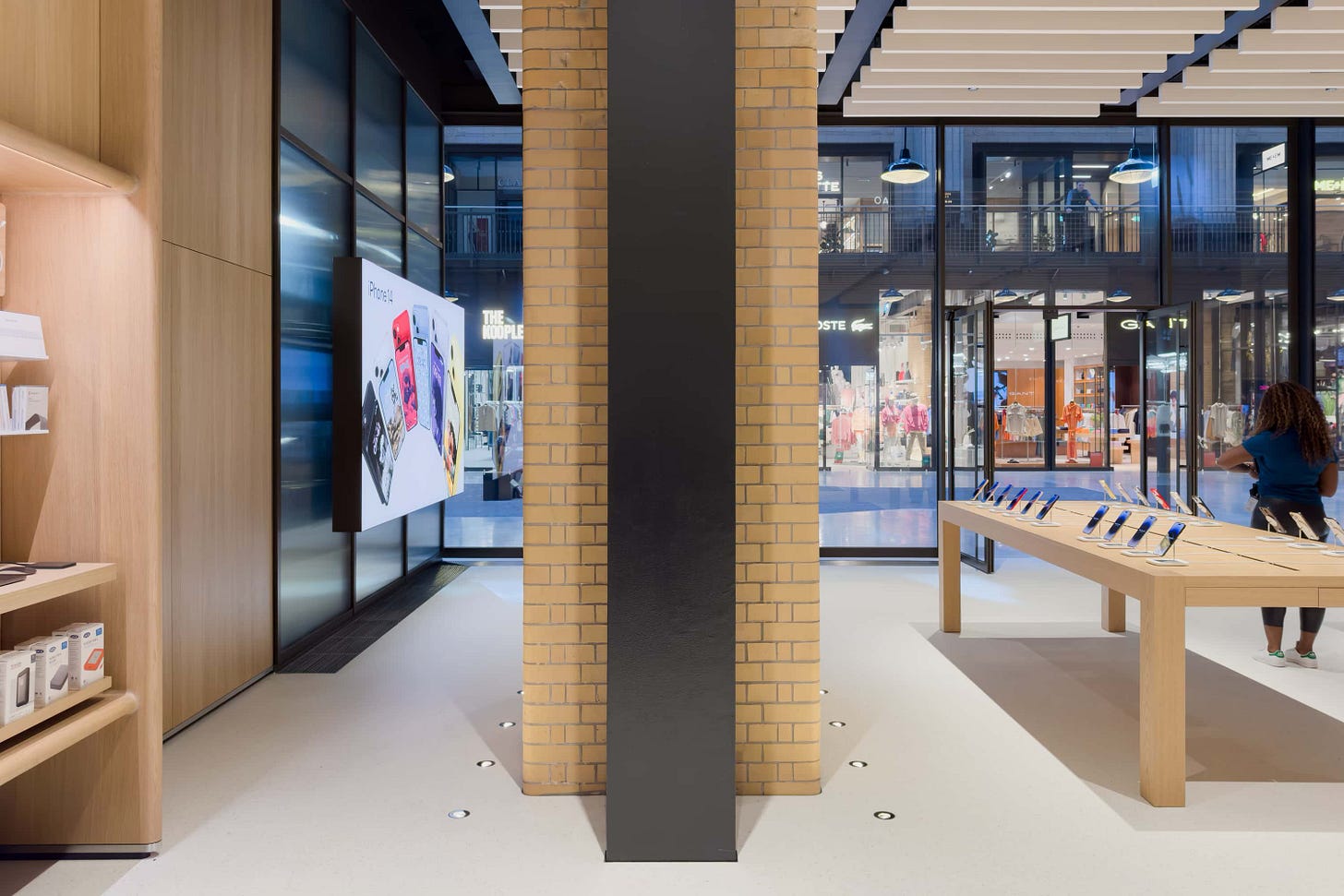
From the facade to the back wall, the store presents a nearly smooth gradient from a design that’s all Battersea to one that’s all Apple. The entrance is rigid and defined with dark metal framing matching the industrial feel of the turbine hall. Inside, the left and right walls begin with smoky textured glass panels that hint at the structure behind. Suspended graphic panels introduce the store beyond.
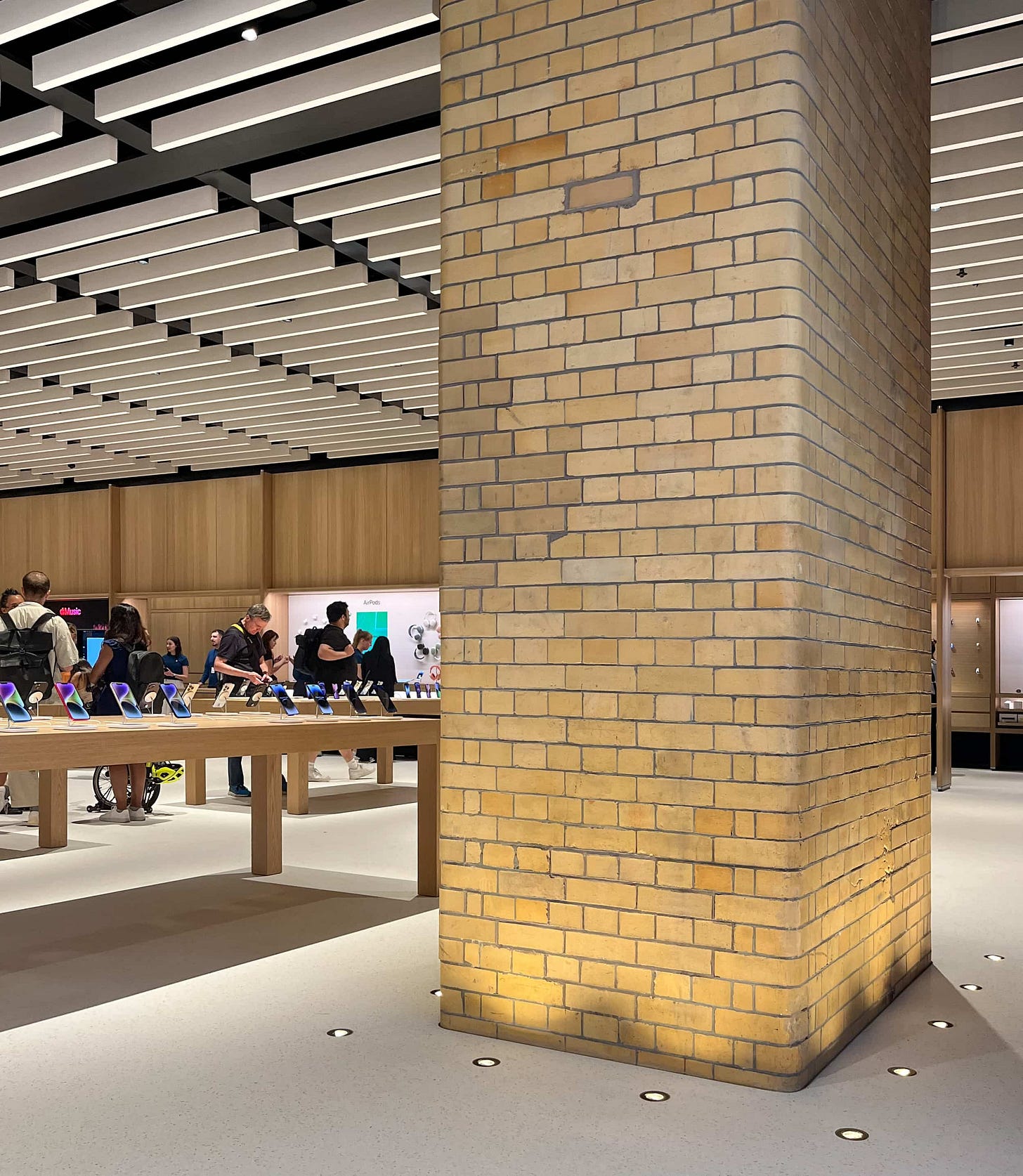
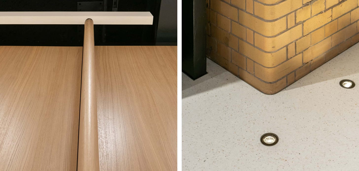
Even the baffle ceiling hesitates a bit before dropping in ahead of four massive brick columns that define the entire atmosphere of the store. Normally Apple tries to eliminate structural columns — this was a major engineering effort at Tysons Corner — but here each column is emphasized with lighting illuminating the base. Every brick is part of the restored fabric of the building, and although the columns are mostly decorative today, they play an important role in supporting the historic link between the station’s past and future.
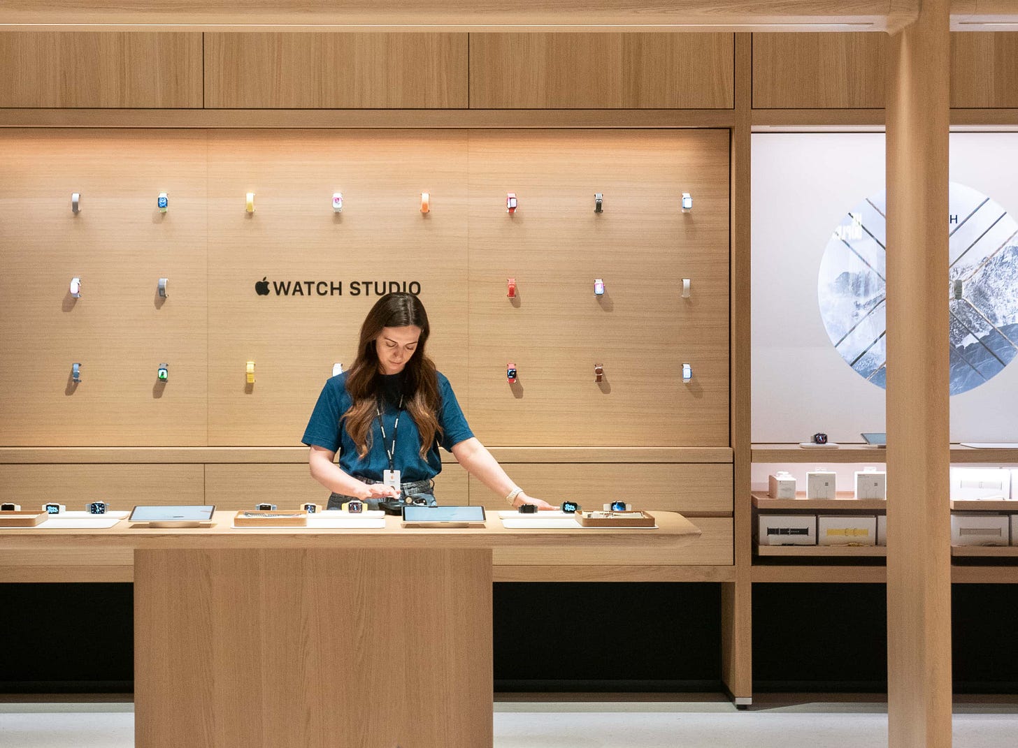
The Avenues begin after the columns and wrap around to the all-wood back wall. By the time you reach the Experience Room at the far end, every surface is distinctly Apple. At some angles, it’s almost impossible to distinguish the back of Apple Battersea from Tysons Corner. It’s remarkable how the design guides you between contrasting environments almost unnoticed within the span of just a few feet.
At Battersea, product bays are interspersed with the Genius Bar, Apple Pickup, and Experience Room, not stationed on opposite sides of the store. As a result, the function of each area is a bit less defined and identifiable but the concept of the Avenue as a system of interlocking, interchangeable components comes into sharper focus. Though the engineering must be much more complex, the store appears as if it could be broken apart and reassembled into an infinite number of configurations — like an oak LEGO kit.
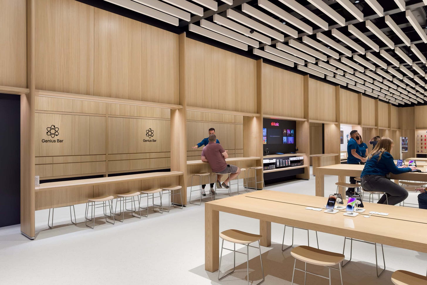
The idea of modularity extends to the grid of ceiling baffles separated by black metal supports. It’s a notably different look than the store-width baffles of Tysons Corner, and it’s too early to say which design will ultimately be the outlier. The same is true of the missing store-width graphic panel.
Apple Battersea also includes what feels like an unusual table configuration. There’s an expected set of new low and bar-height tables, but Today at Apple is located in the rear center, not in the corner like every other Forum Display. iPhones fill the four rightmost tables, and desktop Macs — desktop Macs! — are up front behind the Apple logo.
Some of these changes can probably be attributed to the shallow two-table depth of the space, the new Genius tables, and the position of the entrance doors at the far edges of the store.
For further reading on Apple Battersea, I recommend this design deep dive in Wallpaper*.
Apple Watch Hermès

Apple, Hermès, and artist Agostino Iacurci have partnered on a redesigned Apple Watch Hermès bay at Apple Park Visitor Center. The new display highlights the latest Hermès bands and watch face nestled among the branches and leaves of a vibrant 3D scene that bursts beyond the Avenue frame and into the store.
Apple Watch Hermès has always had a special home at the Visitor Center, and this is the bay’s sixth major installation since the store opened in 2017.
2024 Apple History Calendar
Stephen Hackett of 512 Pixels recently launched the 2024 Apple History Calendar on Kickstarter. This is Stephen’s third year printing wonderfully-photographed calendars, and this year’s edition features notable dates in Apple’s retail & services history. (Disclosure: I helped out a tiny bit with a few of the dates!) The project’s already fully funded and I encourage you to check it out if you like Apple history.
Featured image
Apple 京都
Photo via @risa_____0213.

