Here’s November’s bonus article for paid subscribers. Your support makes Tabletops possible every week. Thank you.
In 2006, Steve Jobs opened the doors of the cube. Four years later, Apple had one store in China and was ready to circle back with a second landmark location. By this time, people could square what you meant by “the cube.” That’s not an easy feat. So for Shanghai, Apple moved to the next solid.
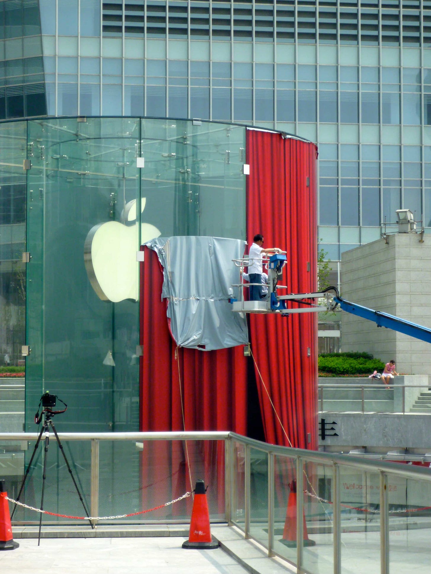
The cylinder, or as the Apple website’s alt text calls it, “glass drum,” was built at Shanghai ifc mall in Pudong. According to architects Bohlin Cywinski Jackson, work began in 2008, and:
… the project team was familiarized with the government’s plans for constructing a large, elevated circular walkway over the intersection [to the Oriental Pearl Tower] to transform the pedestrian experience in time for the 2010 Shanghai Exposition.
That’s a tight timeline for any store, much less one as significant as Pudong. Apple could draw inspiration from the cube, but that’s about it. Structural curved glass is a mind-bending feat of engineering.
TriPyramid, Seele, and Eckersley O’Callaghan worked in collaboration:
The design team worked intensively with fabricators in China to develop the first of its kind production facility to make 13m tall curved, toughened and laminated panels of glass in one piece, far exceeding anything of this nature previously made, either flat or curved.
In September 2010, Steve Jobs called Apple Pudong a “landmark in glass engineering.” That landmark was covered by a red vinyl stage curtain before opening, and celebrated with a special red t-shirt featuring a top-down illustration of the cylindrical design. The plaza was finished with a shallow reflecting pool, and a spiral glass staircase (just like the cube’s, minus the elevator) led underground.
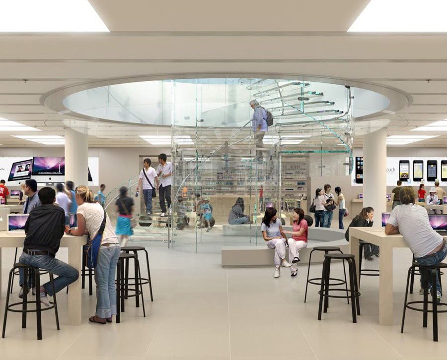
In many ways, the basement level is the most interesting part of the store. Apple’s obsession with perfecting a singular form — the subterranean store with a spectacular glass entrance — gives us a remarkable timeline of the evolution of Apple Retail design.
Four years passed between the cube and the cylinder, and Apple Pudong looked refined. There was a Briefing Room and a long, dedicated Genius Bar. Gone were the iPod Bar and The Studio. Accessories moved from the main display area to a separate room. The overall form of the store was more pleasing due to the harmony of the cylindrical entrance and spiral staircase.
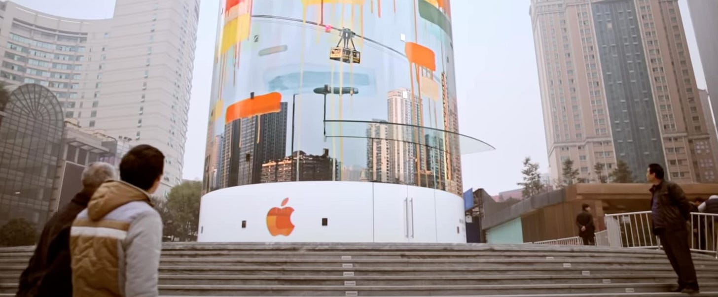
In 2015 Apple tried again, this time in Chongqing. On a circular pedestal in Guotai Plaza, a public space in the Jiefangbei business district, a second cylinder rose inside an octagonal fortress. The plaza was already elevated, so the glass panels rose a modest 30 feet instead of 40, according to ifoAppleStore. One early rendering of Guotai Plaza depicts a single tree in place of the cylinder.

Apple invited two artists to decorate the store with a wraparound mural acknowledging the culture of Chongqing. Once again, my attention turns to the basement. Almost five years after Pudong, Apple was only months away from unveiling the Vintage D store design when Apple Jiefangbei opened. Every surface demonstrates lessons learned in Manhattan and Shanghai.

The floor was new — not quite the white terrazzo you know so well, but no longer the same stone tiles from the classic days. Lighting is accomplished with long, narrow glowing tracks spaced evenly across the ceiling — a much more elegant solution than fluorescent panels. There was finally an underground entrance.
Perfect circles are impossible to create, so perhaps Apple has doomed itself to forever pursuing an idealistic dream it can never attain. In 2017, some designer changed the filename to Apple-Store-final-final-final-FINAL.psd. Apple Kunming is another cylinder, but not like before. This time, a pavilion entrance was created with 16 swing and 8 pivot glass doors. The structural glass forms “u-columns” that support a carbon fiber roof. In the center is a lightweight acrylic skylight.
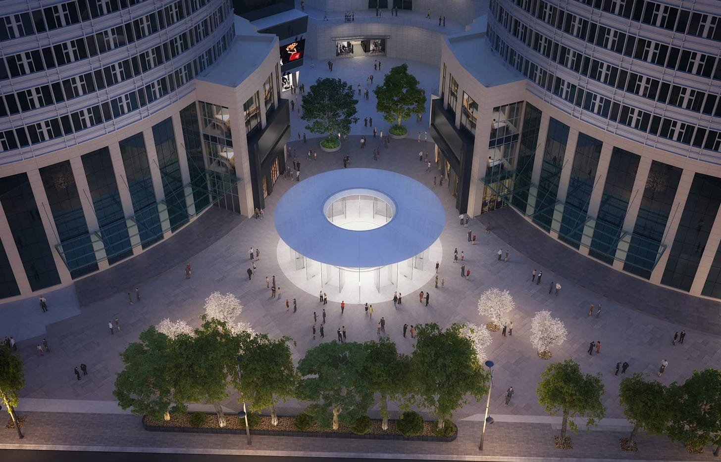

A familiar glass staircase leads down to the first subterranean-format store with a Forum. Today, Apple Kunming is relatively obscure, and that makes the design feel just a bit uncanny. It’s like an alternate reality version of its more famous sibling, the cube. But that alternate reality almost did exist.

In 2015, when Apple began exploring concepts for the cube’s big redesign, Bohlin Cywinski Jackson drew a plan that split the space into three sections: one large room with display tables below the staircase, and two smaller wings with Avenues and support tables, lit from above by reflecting pool skylights. In a rendering, the overall atmosphere is nearly indistinguishable from Apple Kunming:
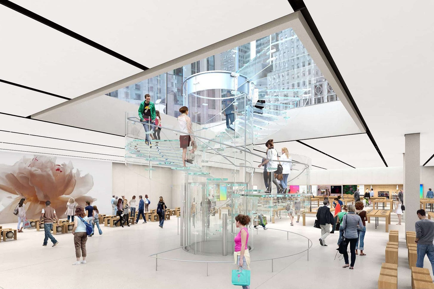
With some perspective, it’s easy to connect the dots from the first subterranean stores through to Steve Jobs Theater. One can imagine that if not for more than a decade of structural glass engineering and design experience in Manhattan, Shanghai, Chongqing, and Kunming, Apple Park wouldn’t have been possible in its current form.
If you’d like to suggest a topic for me to research for next month’s bonus article or have a story to share, send me an email. You can view this post and the entire Tabletops archive on the web at any time here.


Another great article. The CCP disregard for humanity, dignity and safety is probably the sad reason they allowed riskier designs which propelled glass engineering forward. Some stunning stores and excellent coverage as usual.