Apple South Shore reopens
A new store just in time for the holiday season.
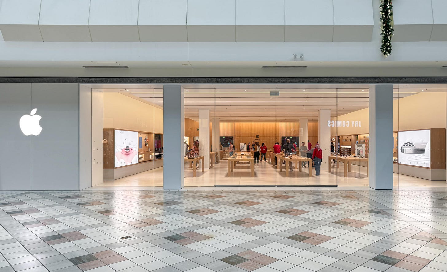
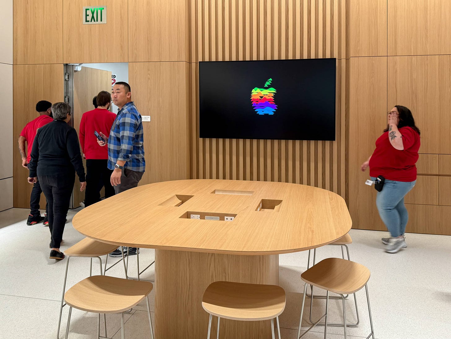
Apple South Shore reopened on Saturday in Braintree, Massachusetts. The new store is compact — roughly 3,500 square feet, 45 feet wide, and filled with 12 tables, an Apple Pickup Counter, and mirrored Today at Apple zones. Tabletops reader Frank Chen was the first customer inside and shared the photos in this article.
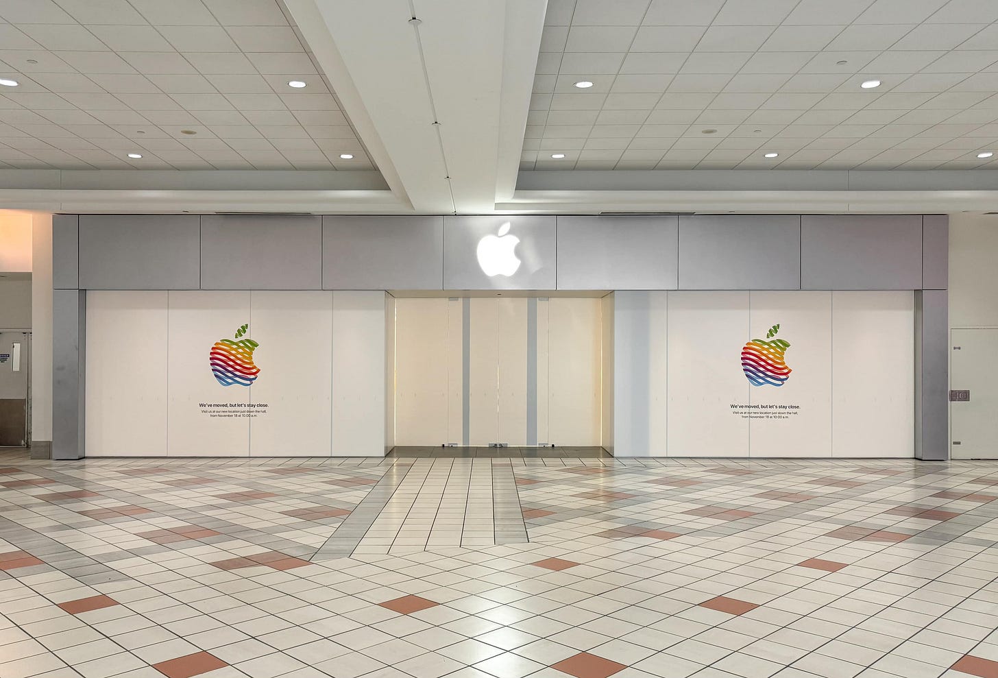
The storefront is quartz, with two columns and centered sliding glass doors. Behind the panels with the Apple logo at the left of the entrance is unoccupied space.
It’s not obvious in photos, but the outermost tables in the second and third rows are somewhat reduced in length to accommodate the columns and provide accessible routes throughout the store.
After closing, the old store was wrapped with vinyl and the logo you know so well. (It was first used two years ago this month.)
This move was obviously a dramatic improvement, and I’m sure the store team and customers will love the new space. But I already know what you’re thinking: why wasn’t this brand new store built with the latest design?
I’ve been tiptoeing around this topic for months, waiting to offer an opinion as the design strategy crystalizes. I tried touching the subject two weeks ago and earlier in August, but I’m no longer totally satisfied with what I’ve written. As the question is now inevitable, I’ll try to offer a better possible explanation.
Plans for Apple South Shore were set almost one year ago, and construction began in spring. The gears for this project were turning long before the debut of Vintage E, but notably, the design was finalized months after the plans for Tysons Corner.
When Apple last redesigned its stores in 2015, it took a while for the style pipes to clear. Classic Stores continued to open for several months. With the exception of Apple Aspen Grove — an incredibly unique store that is still a design anomaly today — the last Classic Store to open was China’s Apple Parc Central on January 28, 2016. (The store has since been remodeled.) That’s a four-month transition period between design languages.
We’re now six months into the next design transition, and stores that look like South Shore are still in line. Let me, for a moment, speak like an old guy.
It used to be that new Apple Stores seemed differentiated almost entirely by size and grandeur. High profile stores included nice-to-haves like a Briefing Room and extra tables, but the core experience for everyday customers making transactions was almost identical whether you visited the spectacular Apple Lincoln Park or the modest Apple Crocker Park. The excellence of your local store was mostly a function of how recently it opened.
As I see it, we’re entering an era where new stores are additionally differentiated by feature and experience. Like size and grandeur, this differentiation feels driven chiefly by prestige of the property and expected sales volume of the store. But as a customer, it goes deeper than past superficial differences like whether or not your store has a plank ceiling. The result is that the experience of repairing your Mac or buying a new iPhone will look and feel significantly different from store to store, even with the exact same staff.
Some readers might view this as a regression, and others a deft business move. I’m sympathetic to both opinions. It’s now easier than ever to identify the “haves and have nots” when a new location opens. Your store might not get the design style you prefer. It makes the store fleet, once deceptively consistent in appearance, look as logistically complex as it’s always actually been.
At the same time, tighter resource distribution means Apple can somewhat insulate itself from tumultuous brick-and-mortar retail trends. Properties with smaller stores don’t have to suffer from disinvestment, and extra effort can be spent on the locations customers visit most.
My advice: If you’re still thinking about store openings as a linear path, you might be disappointed in the future. Imagine the future more like a track with several design ideas moving forward in parallel, and things might start to make a lot more sense.
About this iPad
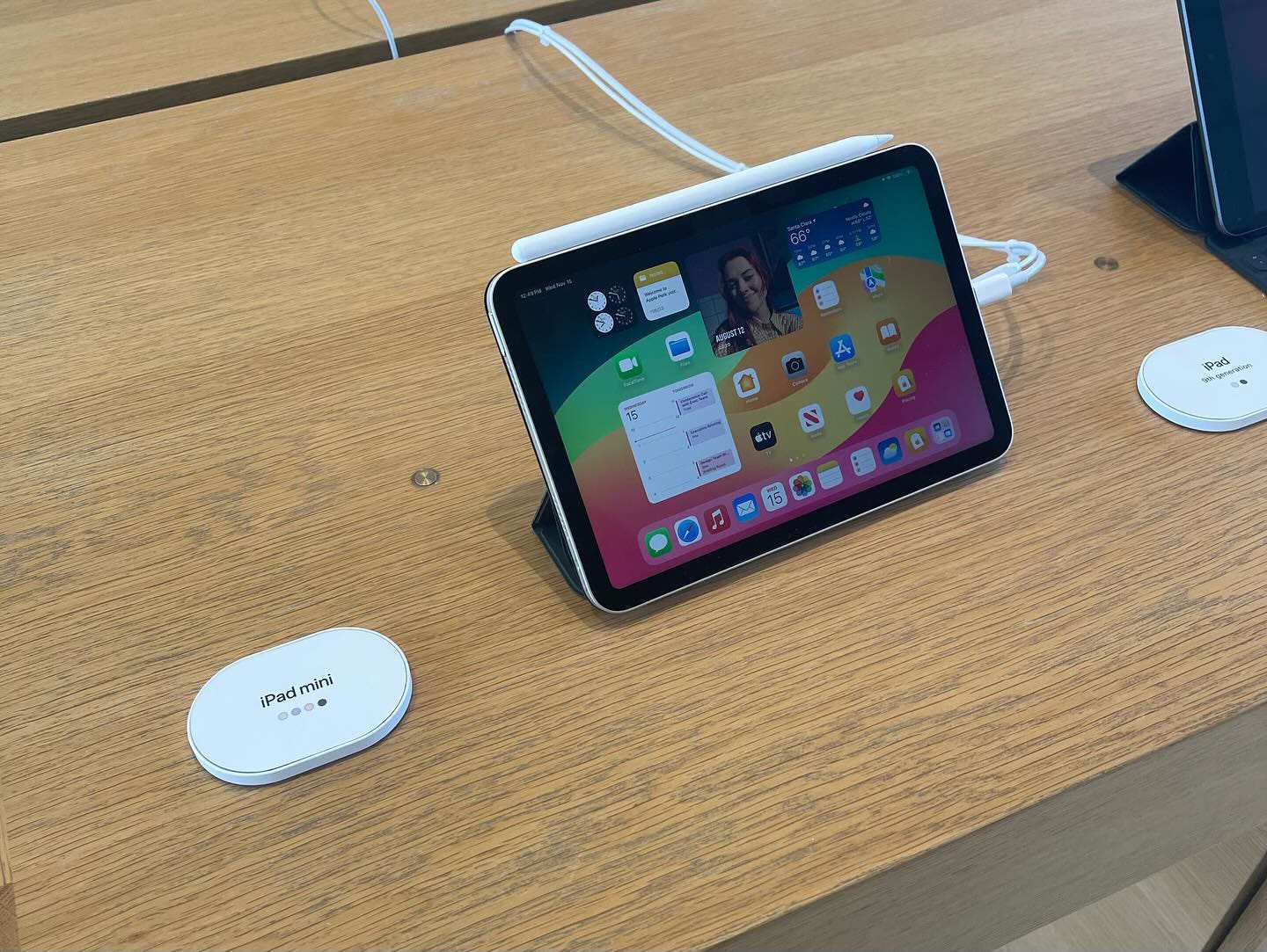
Found recently at Apple Park Visitor Center is the above merchandising pilot that seeks to help customers quickly find the right iPad. Each device is paired with a small capsule-shaped tag that lists the model on display and available color options.
These tags feel like natural complements to the iPhone risers that launched a few years ago, and I imagine they’ll significantly reduce ambiguity between iPad models. I haven’t located this pilot at any stores in the Midwestern US yet, so let me know if you spot it.
Featured image
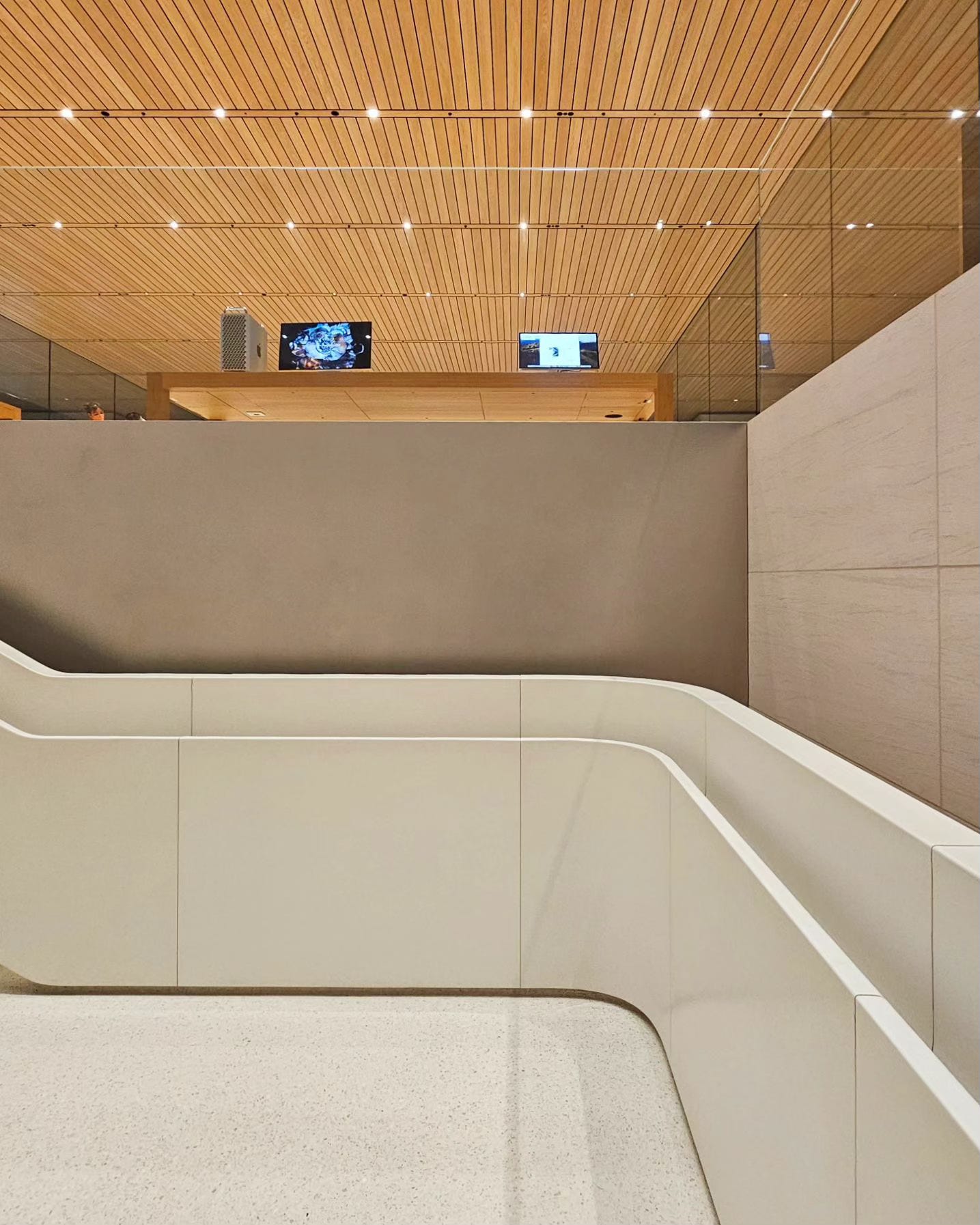
Apple 信義 A13
Photo via @collabo15.

It was me who installed those merchandising pilots in our store in Quebec.