Apple Tysons Corner: A new chapter
Say hello to an all-new Apple Store experience.
This is a very special edition of Tabletops celebrating the all-new Apple Tysons Corner. In lieu of a regular newsletter on Monday, I’ll be sending paid subscribers my full gallery of photos from the store media preview and additional details and observations about the new space. If you’re not a paid subscriber, you can upgrade this week only for R010% off a lifetime subscription.
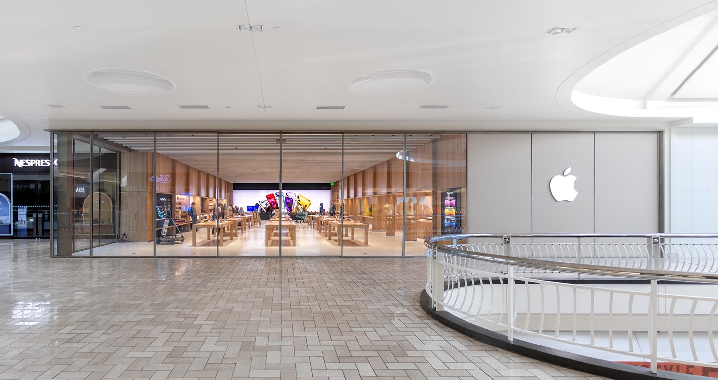
Today, Apple revealed its most comprehensive redesign of the Apple Store experience in nearly a decade. The Genius Bar is returning with a reimagined design. There’s an all-new space for more immersive product discovery. Store accessibility has been improved, and new design elements emphasize sustainability. It was 22 years ago at Tysons Corner that Steve Jobs showed the world how to “Shop Different.” Now Apple is back in the mall where it all began to start a new chapter.
The Genius Bar returns
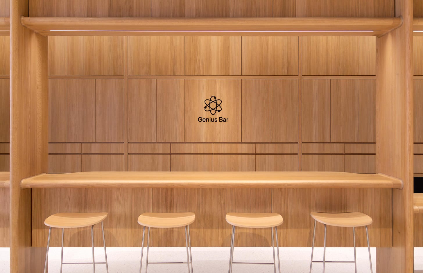
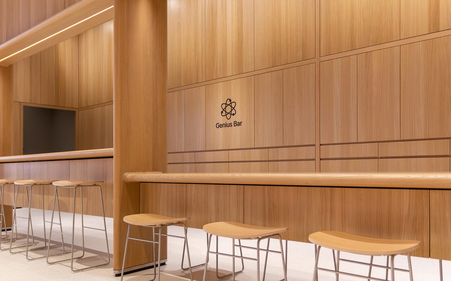
Genius Bar support has been fundamental to the Apple Store experience since day one, and now Apple is once again creating a dedicated, identifiable space within the store for customers to find solutions. At the new Apple Tysons Corner, the Genius Bar is located exactly where it was in the first Apple Store — the far right corner. The new bar is built into an alcove lined with wood credenzas attached to backstage. Sitting and standing counters enhance accessibility.
This is the first time a physical Genius Bar has been installed in a new Apple Store since 2015, when Apple last redesigned the store experience. Even the atomic Genius Bar logo is back with an updated design .
For another perspective of Apple’s new retail experience, I highly recommend checking out this beautifully-rendered gallery by my friend and designer extraordinaire Filip Chudzinski. I advised Filip on the store’s design ahead of the opening, and his visualizations capture the essence of the store in remarkable detail.
An all-new experience
A first for any Apple Store, Apple Tysons Corner includes a new flexible space that acts as a deeper, more immersive extension of the Avenues. Apple says the products and fixtures in this space may change over time to spotlight the latest hardware.
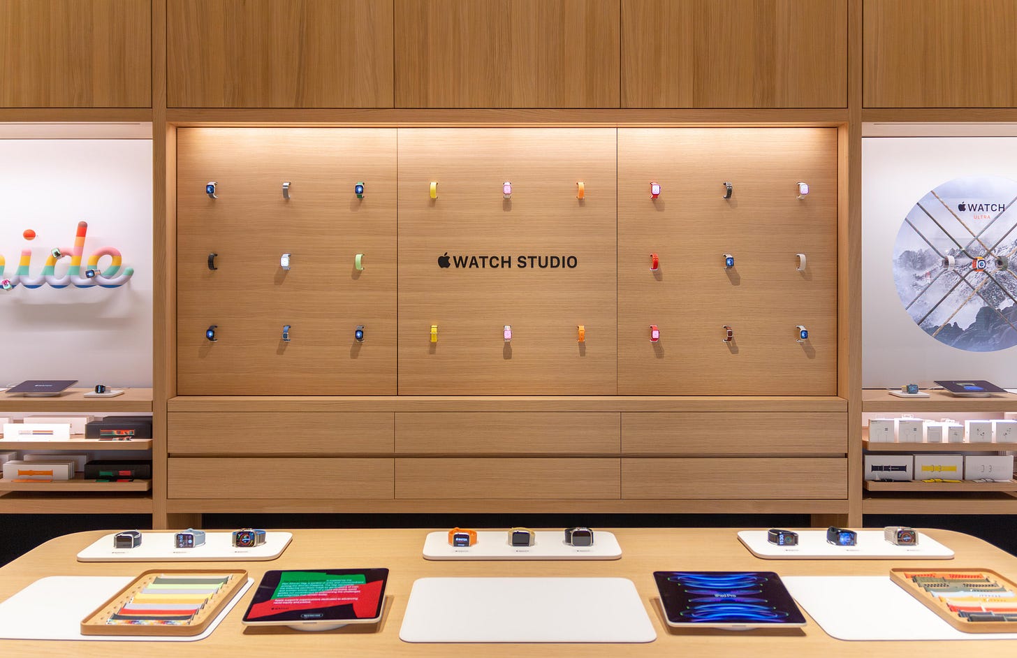
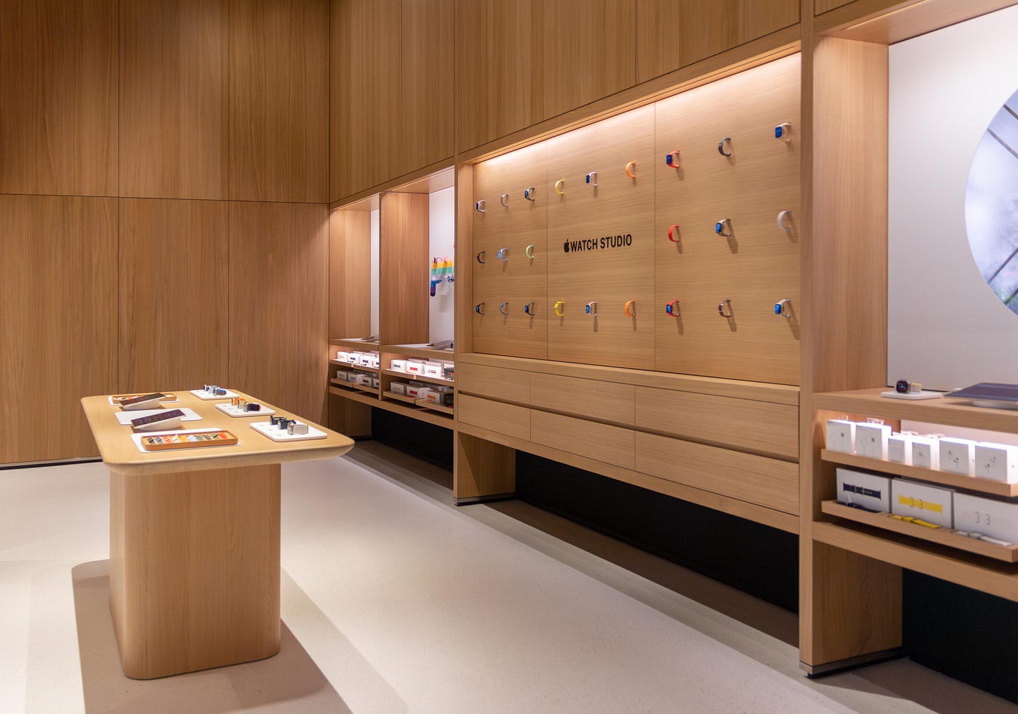
In the center of the alcove, located just to the right of the store entrance, is a large, rounded-edge counter — similar in design to Apple Pickup counters in other recent stores. It’s in this space that an in-person version of Apple Watch Studio comes to life. Customers can get hands on to mix and match Apple Watch bands and case styles. Previously unseen Avenues along the back wall feature various bands, and two special installations highlight Apple Watch Pride Edition and Apple Watch Ultra.
Accessibility improvements
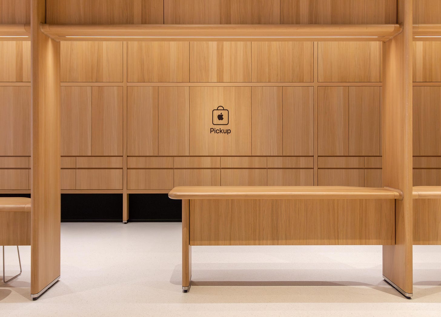
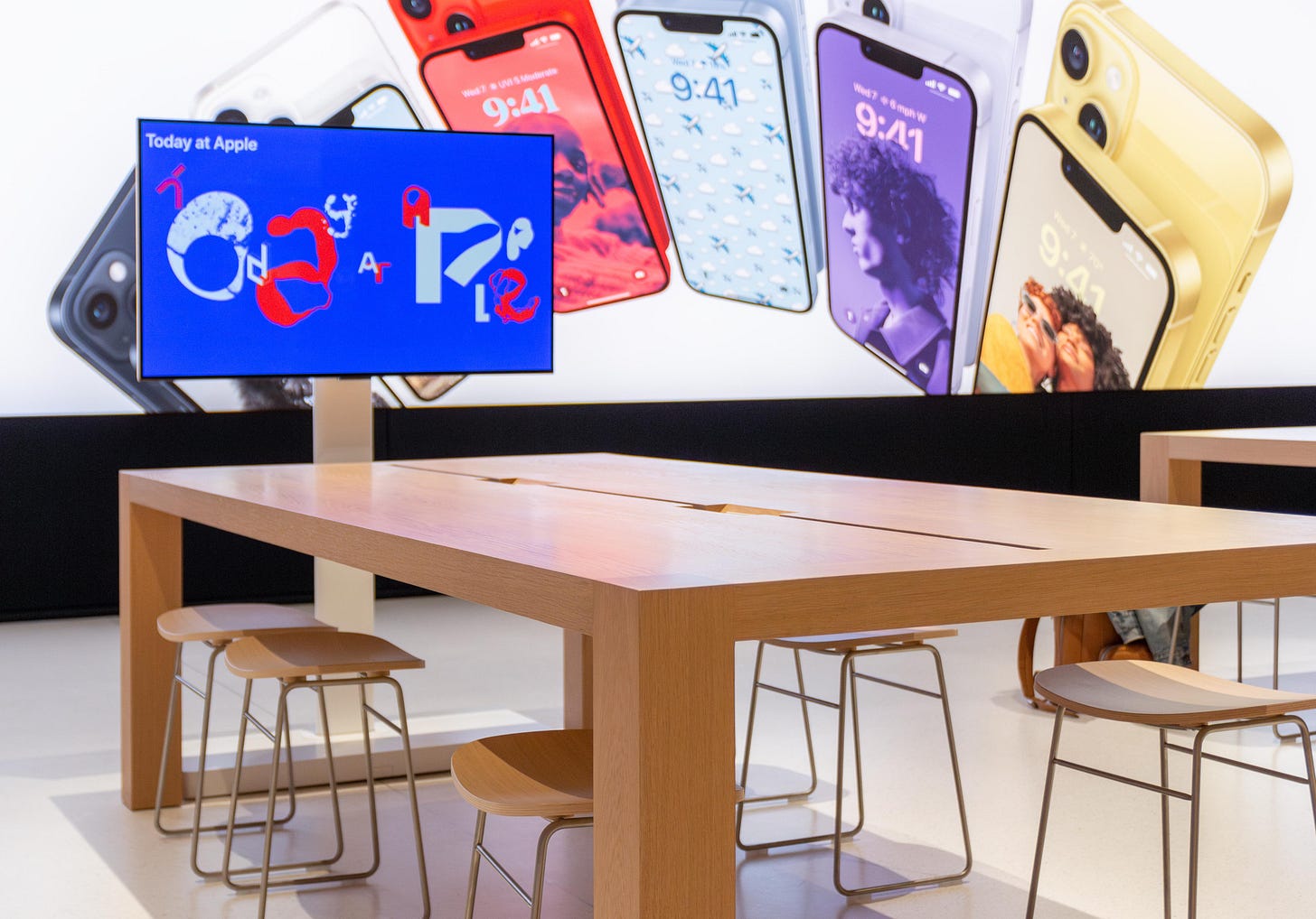
Apple Tysons Corner is the most accessible Apple Store yet, so it’s fitting that it was revealed on Global Accessibility Awareness Day. In addition to sitting and standing counters at the Genius Bar and an accessible Apple Pickup counter, Apple has lowered the height of its iconic tables — specifically those used for service and learning — to improve access for wheelchair users. The aisles between tables have also been widened. Like all Apple Stores, Tysons Corner offers a hearing loop system for people who are hard of hearing.
Fresh takes on familiar features
Existing store features you’re already familiar with like Avenues, Today at Apple, and Apple Pickup have been rethought and refined.
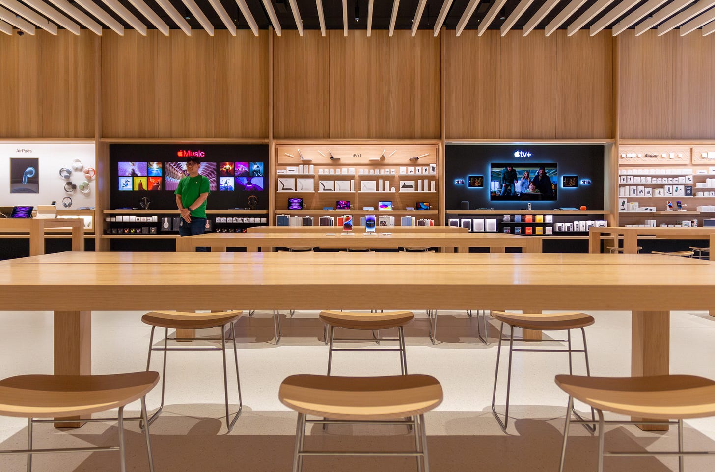
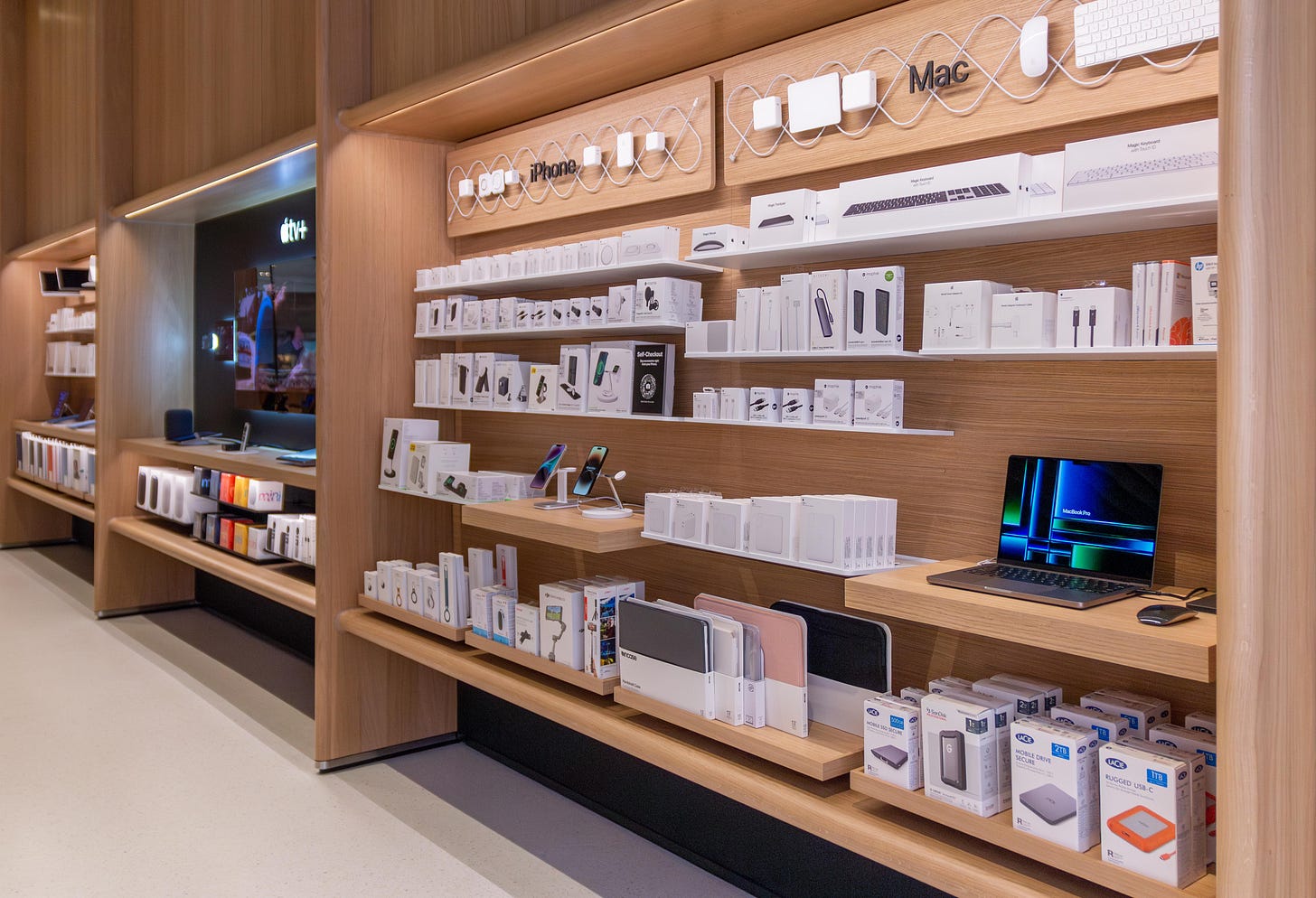
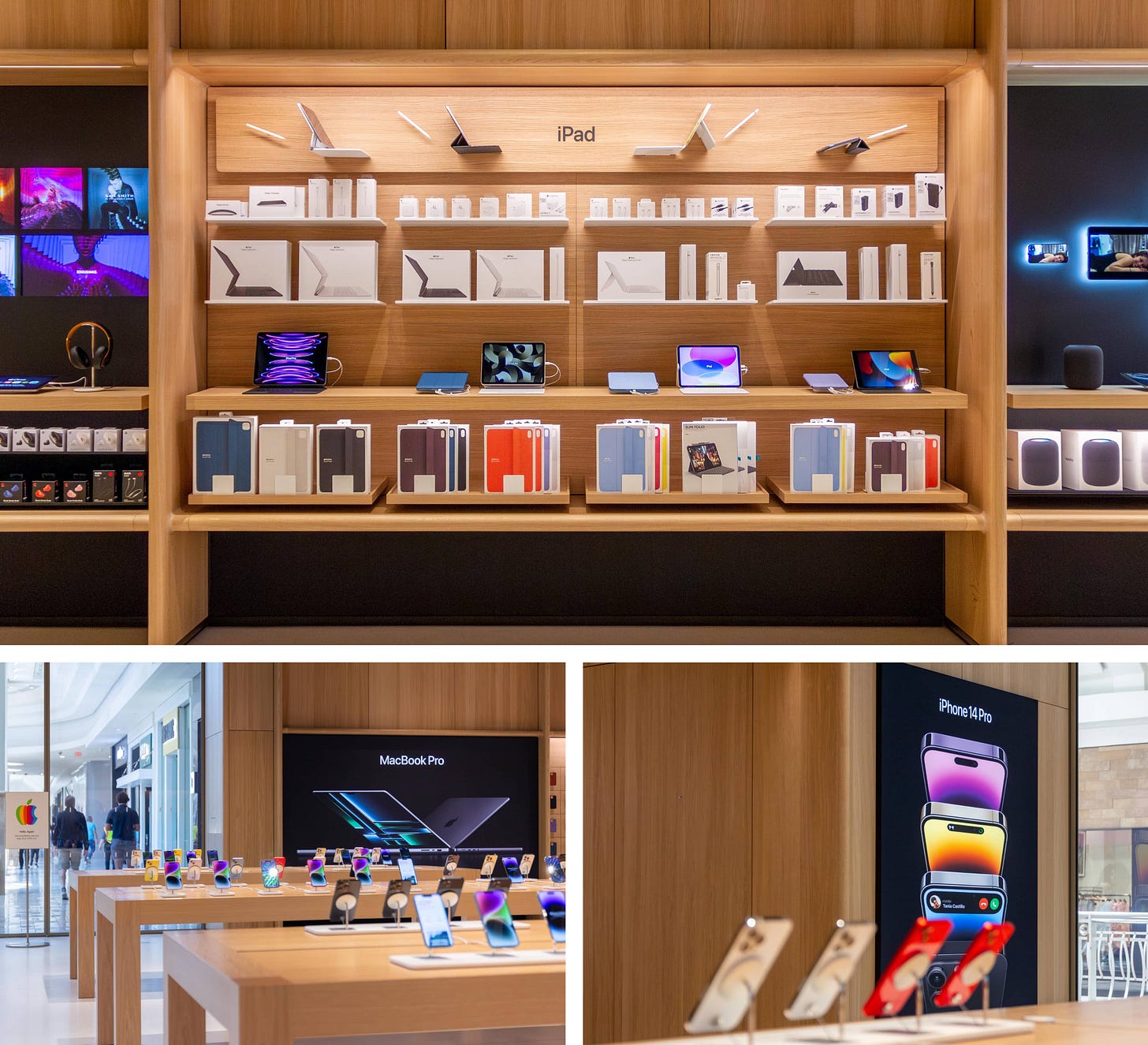
The Avenues, which stretch the entire length of the store’s left side, are integrated into the structure of the wall, forming tall vertical panels that give the store a visual rhythm. The effect is vaguely reminiscent of the dividers that originally organized the Apple Store into themed sections. Some recognizable bays like iPad and Mac accessories have been totally redesigned.
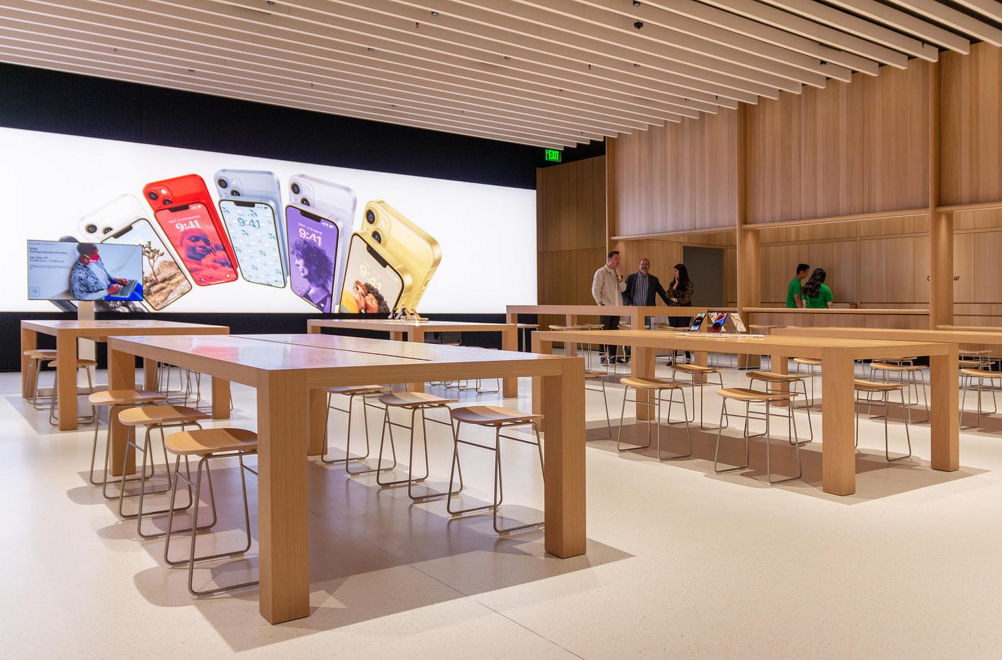
The back left corner is home to Today at Apple, where Creative Pros will gather customers around a new lowered table and a small Forum Display. Apple says lower tables are better suited for longer interactions.
Unlike recent stores that include a dedicated Apple Pickup area in the back center, pickup at Tysons Corner is located on the right side next to the Genius Bar. The low counter is built into the alcove, and a credenza at the back is filled with customer orders ready to pick up.
Material palette
Apple Tysons Corner still has those recognizable terrazzo floors, but just about every other surface is new. A massive fabric graphic panel is stretched across the entire back wall. The majority of the wall surfaces in the store are finished with wood panels that match the white oak tables and make the store feel incredibly warm and inviting.
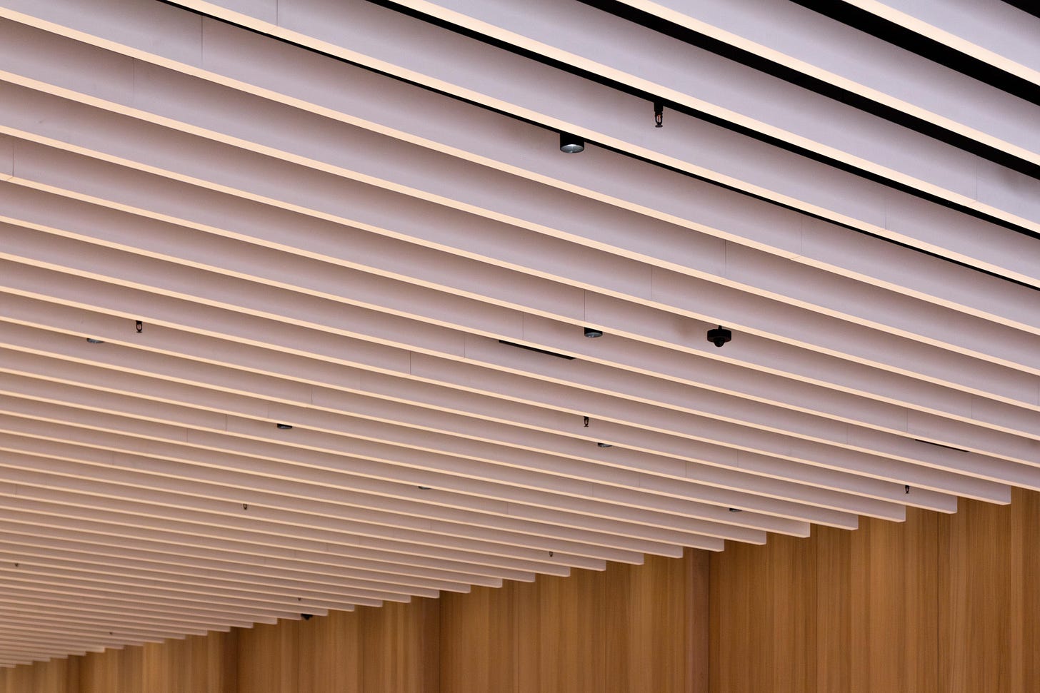
Instead of a light box ceiling, Apple has created a new linear baffle ceiling structure designed with acoustics in mind. Lighting is placed between the individual white baffles. Apple says the store’s biogenic materials and fixtures were chosen to be environmentally sustainable, and a sampling of their vendors for this project supports those claims.
First impressions
It’s immediately obvious in photos that Apple has rethought every single detail of the Apple Store experience, but I can’t stress to you enough just how different the store feels. Apple Tysons Corner is simply one of a kind — though I expect we’ll soon see more like it.
Apple has completely shifted the store’s center of gravity. Older stores drew your attention to the back center first with the Theater, then the Genius Bar, then the Forum. This new design creates three distinct zones: the Avenues along the left highlight Apple Services and accessories, the center is home to product discovery, and the right wall is dedicated to more personal interactions — Genius Bar, Pickup, and experiences.
The storefront has changed, too. Every glass panel and sliding door is individually framed, and the facade Apple logo is extruded from the matte wall surface.
Even though Genius Bar service never disappeared, I think customers appreciate having an identifiable place in the store to visit for service, so bringing back the physical bar feels like a smart move. Perhaps what’ll be most surprising to the closest retail watchers are the redesigned Avenues. Apple’s thinking on what an Avenue can be has clearly evolved. There are so many new merchandising concepts in this store. I can’t wait to share more with you soon.
I’ll be publishing additional thoughts, details, and many, many more photos this Monday in a bonus article for paid subscribers, so consider chipping in for a subscription if you find my work valuable. This visit wouldn’t have been possible without the generosity of paid subscribers.
And if you’re in town for the opening tomorrow, say hi! You’ll also receive a special tote bag!

Pretty neat. Would love a standard checkout area similar to the pick up area — it can be remarkably frustrating sometimes buying a simple accessory and wanting to check out
Looks amazing! Apple Short Hills skipped the last design, hopefully this look comes soon.