The details of Apple Tysons Corner
More than 150 photos and observations of every new design detail and merchandising idea.
In the history of Apple Retail design, there are five days I recognize as watershed moments:
May 19, 2001: The opening of Apple Tysons Corner, the first Apple Store
October 16, 2004: The introduction of mini stores and a preview of the all-stainless steel design language that defined a decade of stores
May 19, 2006: The opening of Apple Fifth Avenue, a moment that raised the architectural profile of Apple Retail forever
September 19, 2015: The opening of Apple Brussels and Infinite Loop and the introduction of the “New Store Design”
September 24, 2021: The opening of Apple The Mall at Bay Plaza and the addition of Apple Pickup spaces
After last week, I’m adding a sixth day to the list: May 19, 2023: The reopening of Apple Tysons Corner.
Over the next few weeks on Tabletops, I plan to dissect the changes that were unveiled last Friday in an attempt to better explain to you and personally understand the direction of Apple Retail. Though your local stores may not change dramatically for years to come, the ideas introduced at Tysons Corner will immediately and eternally impact all Retail decisions going forward, as well as the content of this newsletter.
Today I’m going to focus on details and personal observations — from clap out at the old store to every new bit of merchandising and fixture design. This post is an attempt to catalog the store objectively for your study. Along the way I’ll be sharing more than 150 photos of overlooked moments and subtle changes that are easy to miss but so important to the greater story.
Email limitations prevent me from embedding my entire gallery here, so I’ve created the iCloud web album below to reference as you read this article. You are free to download as many photos as you’d like from the album — attribution on blogs is appreciated.
The clap out
It was painful to watch the world’s first Apple Store fade into the mist, but it needed to close. The store was on the verge of becoming a museum piece. When large companies turn inward and get lost in their own history, they begin to rot. Apple’s simple recognition of the 22-year milestone was extremely tasteful.
At the clap out, friends, employees, and a few fans gathered to watch the doors close. John, the last remaining day one employee of Apple Tysons Corner, had the honor of locking the store’s doors for the last time. A crew quickly got to work covering the windows with vinyl decals that directed customers to the new store.
The new store
In 2001, there was no plaza adjacent to Tysons Corner Center, but today it’s the main entrance to the mall. Apple’s new location is near the doors and much easier to find. In discussions with mall management, I learned that the entire ceiling of the mall above Apple’s space was demolished and rebuilt to be self-supporting and eliminate interior columns. Steel was hoisted over the mall with cranes and moved into place. No expense was spared.
The new store exterior is much more defined and rigid in appearance than any mall store built since 2015. Every glass panel is framed by brushed metal, including the sliding doors. The prominent vertical lines complement the repetition of the ceiling baffles and Avenue sections. That said, this is a design choice that might be polarizing. From the use of metal to the gray matte glass(?) behind the facade Apple logo, the store entrance has a formality to it that I’m not used to.
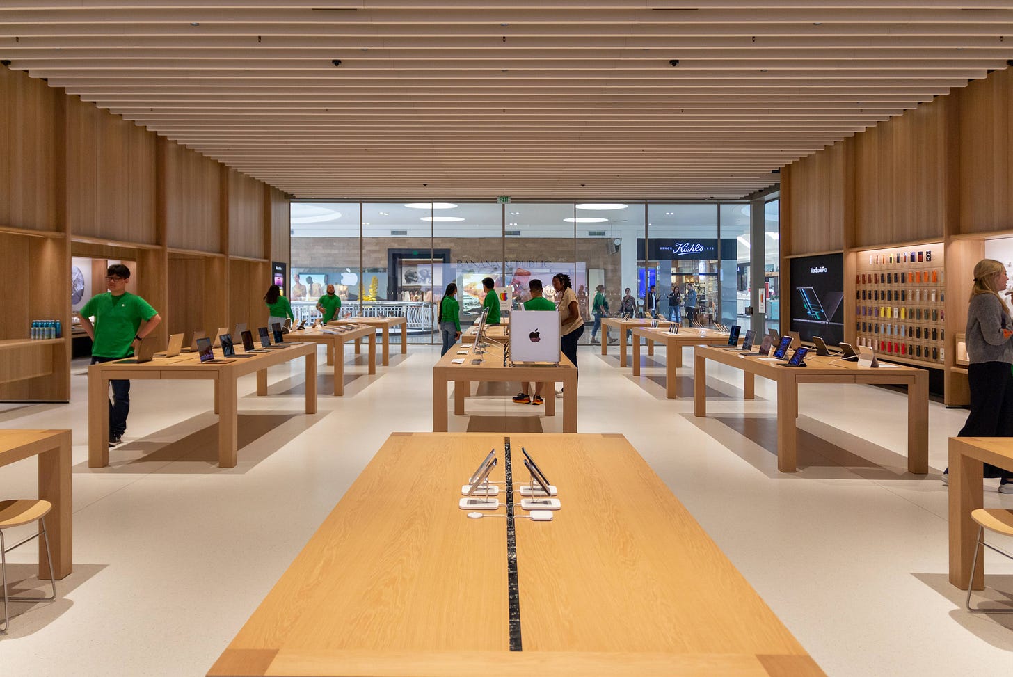
Everything changes when you step through the entrance. Apple Tysons Corner exhibits an incredible warmth and comfort distinct from any previous Apple Store. One of the loudest critiques I continue to hear about the last generation of mall stores is that the bright lights and white walls feel too “cold” or “clinical.” This new design fully addresses those complaints.
Apple’s extensive use of wood throughout completely transforms the store environment. The texture and grain pattern of the wood walls feels slightly more visible and varied than the tables and Avenue components. Perhaps this is an illusion or the wood is sawn differently — it’s hard to say.
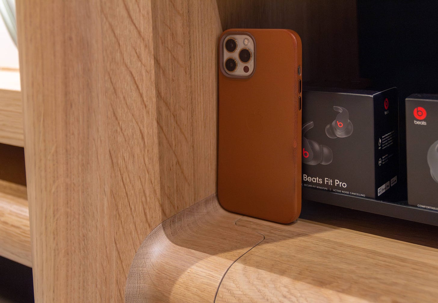
The corners and edges of almost almost every wood surface in the entire store aside from the tables are curved. I was delighted to find that the corner radius of the Avenues perfectly matches the corner radius of my iPhone. Softening the edges makes the wood almost irresistible to touch. You’ll want to grab the Avenue frame, hold on to the counters, and lean against the walls. With softer edges, the entire wood structure of the store exudes an incredible strength and stability that’s impossible to communicate in photos alone. I was shocked by how much more premium and refined this design feels than the quartz walls and inset Avenues of previous stores.
Have you ever unwrapped a new iPhone or MacBook, picked up your previous device, and immediately recognized how old it suddenly feels? That’s exactly what it feels like to visit any previous Apple Store after leaving Tysons Corner.
By making the Avenue frames a physical and visual structural component and the guiding principle by which the entire floor plan is now organized, Apple has cemented these fixtures as the future of its merchandising strategy. In fact, even the Genius Bar, Apple Pickup counter, and Apple Watch Studio are essentially Avenues now — just deeper. The Avenue might become the most enduring and innovative retail design element Apple has ever created, long outliving every other component of the store.
Take a look at the comparison below to see how the Avenue design has evolved over time. Original Avenues were comprised of an outer frame and several smaller inner frames that created a modular, bento box-style design. The latest freestanding Avenues simplified the frame, reducing the number of wood components. And now, Apple has significantly refined the entire Avenue structure with new beautifully fit wood joints and improved lamps. To my eyes, this design feels more modular than ever.
Apple spent a surprising amount of time discussing the new ceiling design and its use of biogenic acoustic materials. The store was mostly empty during the media preview and packed to the doors at the grand opening, so it was difficult to judge how effective the baffles are. As much as I love the softer lighting and inky black “sky” of the ceiling between the baffles, I have conflicting feelings about this new style. Baffle ceilings are becoming fairly common in contemporary commercial architecture, and that could make this one of the less visually unique parts of the store over time, even if Apple’s material approach is superior.
There are a few curious and notable merchandising changes to several recognizable displays: The AirPods bay now has a white back panel, brand new white mats, and a shorter vitrine drawer where sellable product is stored. The Apple TV+ bay is stocked with HomePods, a necessary change since Tysons Corner has no HomePod bay. Other missing bays include AirTag, Fitness+, MagSafe accessories, and Apple Arcade. It’s hard to tell if this is a strategy change or simply a matter of space constraints.
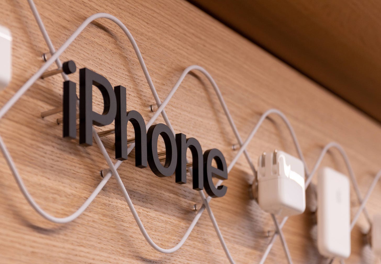
Apple has completely rethought the way iPad, iPhone and Mac accessories are represented. Both bays have dimensional header rows and an assortment of new shelves, counters, and sliding trays. There are nearly invisible wood “blanks” inserted into slots along the back panels of these displays that allow the shelves to be rearranged over time. Both bays are quite busy and filled to maximum capacity with products, but the overall direction is great. The previous essentials bays were almost anonymous and hard to identify from the opposite side of the store.
The Apple Watch Studio area is located to the immediate right of the store entrance. In my mind, this space represents a practical evolution of the Experience Room concept trialed at Champs-Elysées, Carnegie Library, and Fifth Avenue back in 2018-19. Apple doesn’t have an official name for this area right now, but it seems clear to me that they feel a similar way. For the sake of readability, I’ll be calling it Experience Room for the rest of this article.
When you cross the Experience Room threshold, the ceiling rises to create a vault-like atmosphere. There are three bays along the back wall, each with notably sharp corners. Right now Apple is highlighting Apple Watch Pride Edition, Apple Watch Ultra, and the latest band styles. These displays were previously found at Apple Park Visitor Center, and I imagine they’ll be rotated here on a similar schedule. In the center is a wood panel with Apple Watch Studio branding, additional bands, and several locked drawers.
The Experience Room floor is empty aside from a long rounded counter with more locked drawers in the center of the space. On top are even more new fixtures: those same white mats from the AirPods bay and small Apple Watch risers that highlight the latest case styles.
It takes about five seconds for me to imagine what kinds of products Experience Room could feature in the future. I have a feeling this space will soon become one of the most interesting and important parts of the store. But for now, it’s an amazing place to shop for a new Apple Watch. Side note: the table in the store currently merchandised with desktop Macs is an Apple Watch try-on table (you can tell by the drawers).
Genius Bar and Apple Pickup are virtually identical in appearance aside from counter heights and the logos on the walls. In practice, I imagine this entire space will function as one general purpose support area, which is probably fine. The credenzas built into the walls are especially smart and almost totally invisible when the doors and drawers are closed. There’s so much storage along this wall that I struggle to imagine how it will be filled.
Sitting and standing counters are a key part of the new Genius Bar and Pickup designs. The low stools at the bar match the new stools at the low tables towards the back of the store. When I arrived for the media preview, we were seated at one of these low tables, and it truly is a more comfortable place to sit for an extended time, even though Apple is still using the same Cappellini Morrison Stools as before.
The low tables are about four inches shorter than standard product tables. Some of that height savings comes from a tabletop that is roughly half as thick as before. The last table in the far right corner of the store is about three inches taller than standard product tables, with taller stools to match. These differences sound slight on paper, but they’re very noticeable in person.
The Today at Apple table in the left back corner is a new low table with a special design. Recessed areas in the tabletop contain speakers and USB-C ports. Goodbye Beats Pill! There’s also a hearing loop system under the floor in this area — Apple even placed a vinyl decal on the storefront glass to note it.
Creatives may appreciate the updated Forum Display at the head of the table. The LED panel appears to be much higher quality than before and the case of the display is tweaked, but I can’t determine what might be new internally.
That leaves us with the back wall. I’ll be honest: I don’t really miss the Forum here. The fabric graphic panel is reminiscent of an idle video wall in many ways. From a selfish photographer’s perspective, it also makes the store much easier to photograph, since the color temperature of the room isn’t constantly changing. I’m curious to see how seasonal campaigns will affect the mood of the entire store. A panel with a black background, for instance, could make the store feel dim. Marketing images with wild colors could tint the entire room.
When I first learned of the design of the new Apple Tysons Corner, I wondered if Apple was creating a one-off store as a tribute to its first location. But as I walked around the space, I realized that this is something much more significant. Projects of this scope take years of careful thought and planning. Every detail exhibits incredible craft and care. Apple Tysons Corner represents a ground-up rethinking of the Apple Retail experience that addresses customer feedback, accommodates new ideas, and lays the foundation for the next decade of stores.
Thank you for supporting Tabletops. Your subscription helped make this visit possible. If you know someone who would find this article particularly interesting, Substack allows you to gift anyone a month subscription.


I took a few pictures at the Grand Re-Opening of the Georgetown Store today. Let me know if you’re interested.