Fundamentally the same, fundamentally different
A closer look at Apple Pacific Centre.
For the architecturally inclined, a strange sense of déjà vu set in upon seeing Apple Pacific Centre finally revealed. Its design, layout, and atmosphere are all remarkably similar to Apple Sanlitun in Beijing, which opened in 2020 to replace China’s first Apple Store.
Seriously, compare both stores side by side. They’re not quite “I think it’s the same” same, but they are firmly in the Union Square / West Lake uncanny valley.
Like always, Apple Newsroom has a great set of photos, but we are going to go deeper. The similarities are obvious. Context is critical to understanding the differences.
Apple Pacific Centre sits at a 45-degree angle on the corner of West Georgia and Howe in Downtown Vancouver. Between this geographic grandstand and the fact that it replaced the treasured Pacific Centre glass dome, the store needed to be pretty darn good. Pretty darn good it is.
Apple added a concentric, tiered plaza that melts into the sidewalk. There are integrated benches, bike racks, and magnolia trees. This urban context is the first key differentiator from Sanlitun, which is located within the confines of a mall plaza.
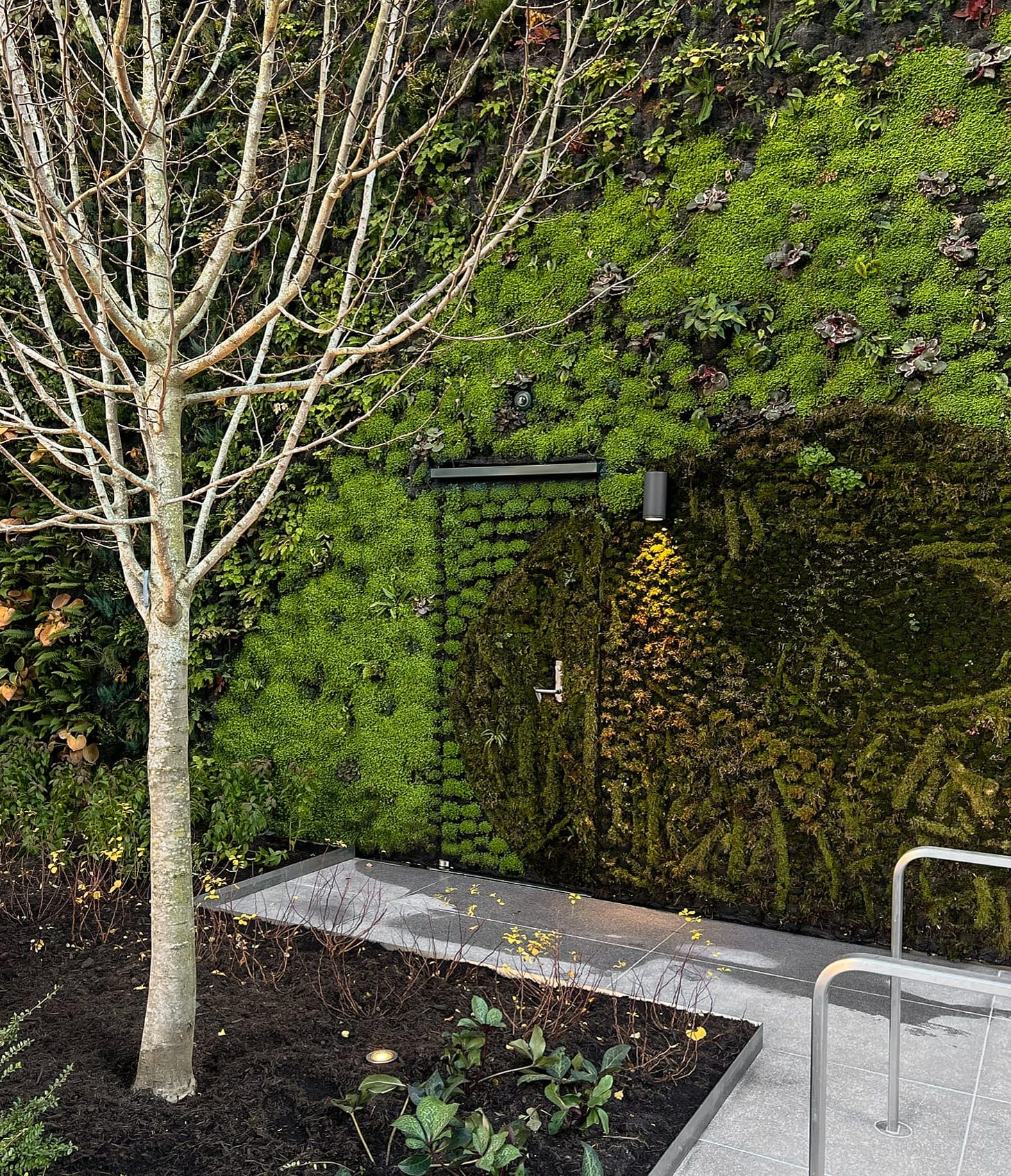
While functioning as a standalone building, it’s also important to remember that the store is directly connected to the indoor mall behind it. That connection is bonded by a more than 40-foot green wall with a secret, moss-covered door hidden among the plants. I can only assume that this is a magic portal to some kind of Willy Wonka universe, and that some day, Gene Wilder will limp out onto the plaza to offer lucky customers a tour of Apple Park. The green wall is illuminated at night and will somehow stay green during the biting cold of winter. I cannot keep a succulent alive on my desk.
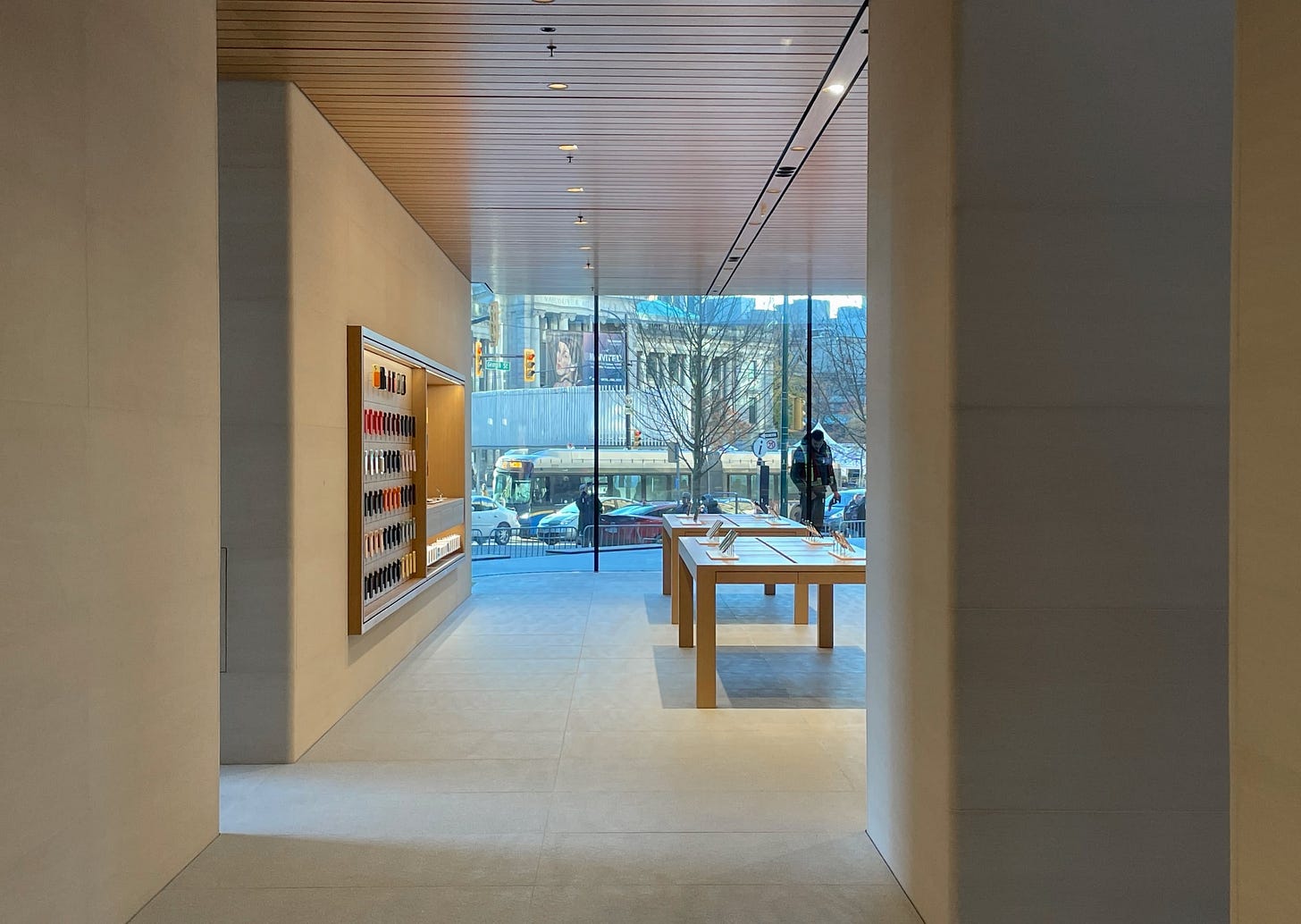
Inside, the mall connection is surprising and understated but not necessarily unprecedented. Like at Marina Bay Sands and Al Maryah Island, Apple has bridged the store and mall rather than opening the entire storefront to the corridor. This design only works because Apple is so desirable that customers will seek out the store. They don’t need to be enticed to enter. That inconspicuous door will probably see more foot traffic than some of the most eye-catching storefronts in the mall.
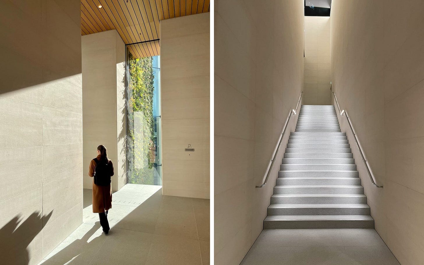
The product area at Pacific Centre has considerably less depth than Sanlitun because of the grand staircase filling the back of the store. (In Beijing, mirrored flights are concealed in the exterior walls.) The stairwell is lit by a panoramic skylight and offers a tiny glimpse of the Vancouver skyline. Apple Lenox Square in Atlanta has an almost identical staircase, but it’ll sure get a lot more attention here.
Apple Pacific Centre surprisingly has no dedicated Apple Pickup counter, but it’s not difficult to imagine where one along the Avenues could fit. Remember, plans for this store circulated publicly in February 2019. The design has been finalized for a very long time.
I have no evidence nor do I wish to speculate, but my gut feeling is that this might be the final* big “Angela project,” and that despite being the latest Apple Store, it no longer accurately reflects Apple’s latest retail design thinking. Technology moves faster than city planning boards.
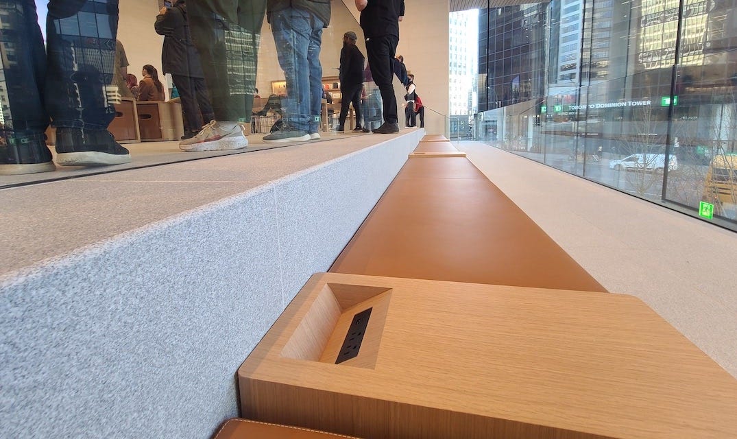
A few more details: The viewing gallery on the second floor includes a row of benches with integrated power outlets. This is only the second appearance of this design element following Apple Aventura in August 2019. Also, here is the souvenir tote bag.
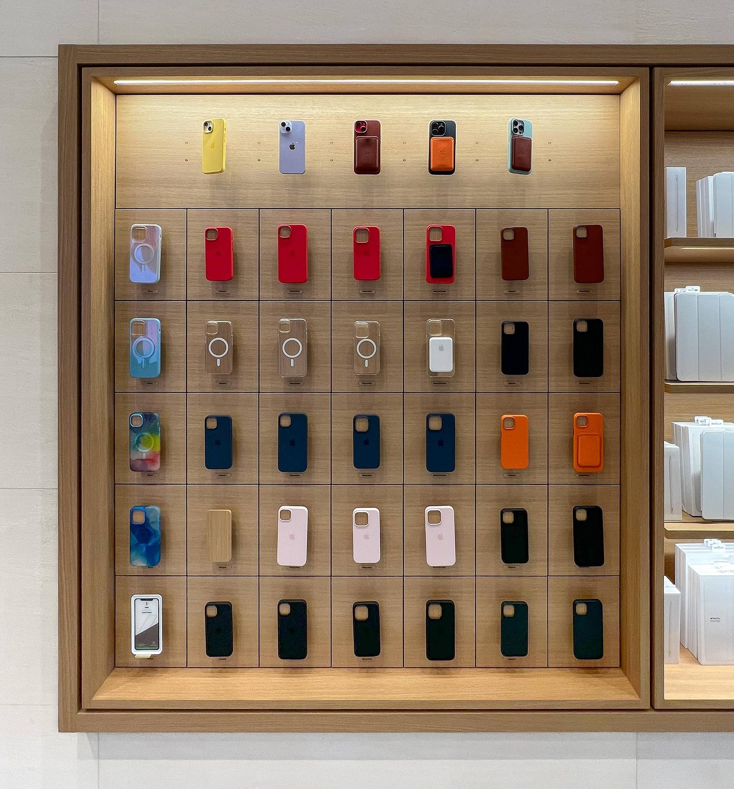
On the second floor in the Forum, the first Avenue immediately right of the video wall is a 5-foot iPhone case bay with the newest, flattest design. This is the first 5-foot instance of that updated fixture globally.
I don’t know if this store has a Boardroom, but if you do, please let me know. 🙂
Featured image
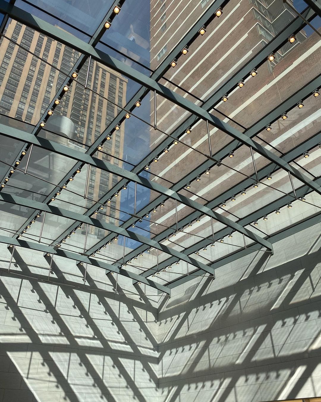
Apple Upper West Side
Photo via Sheridan Chapin.


