Apple White City
Two great tastes that taste great together.
The all-new Apple White City opened in the U.K. on December 8. There is more to this store than what meets the eye, but it’s precisely what meets the eye that might actually be the most intriguing. Let me explain.

White City is a district within London, and Apple White City is located within the Westfield London shopping mall. Presumably, Apple chose not to name the store “Apple London” or “Apple Westfield London” to avoid confusion with Apple Regent Street, and because they’ve never included “Westfield” in a store name.
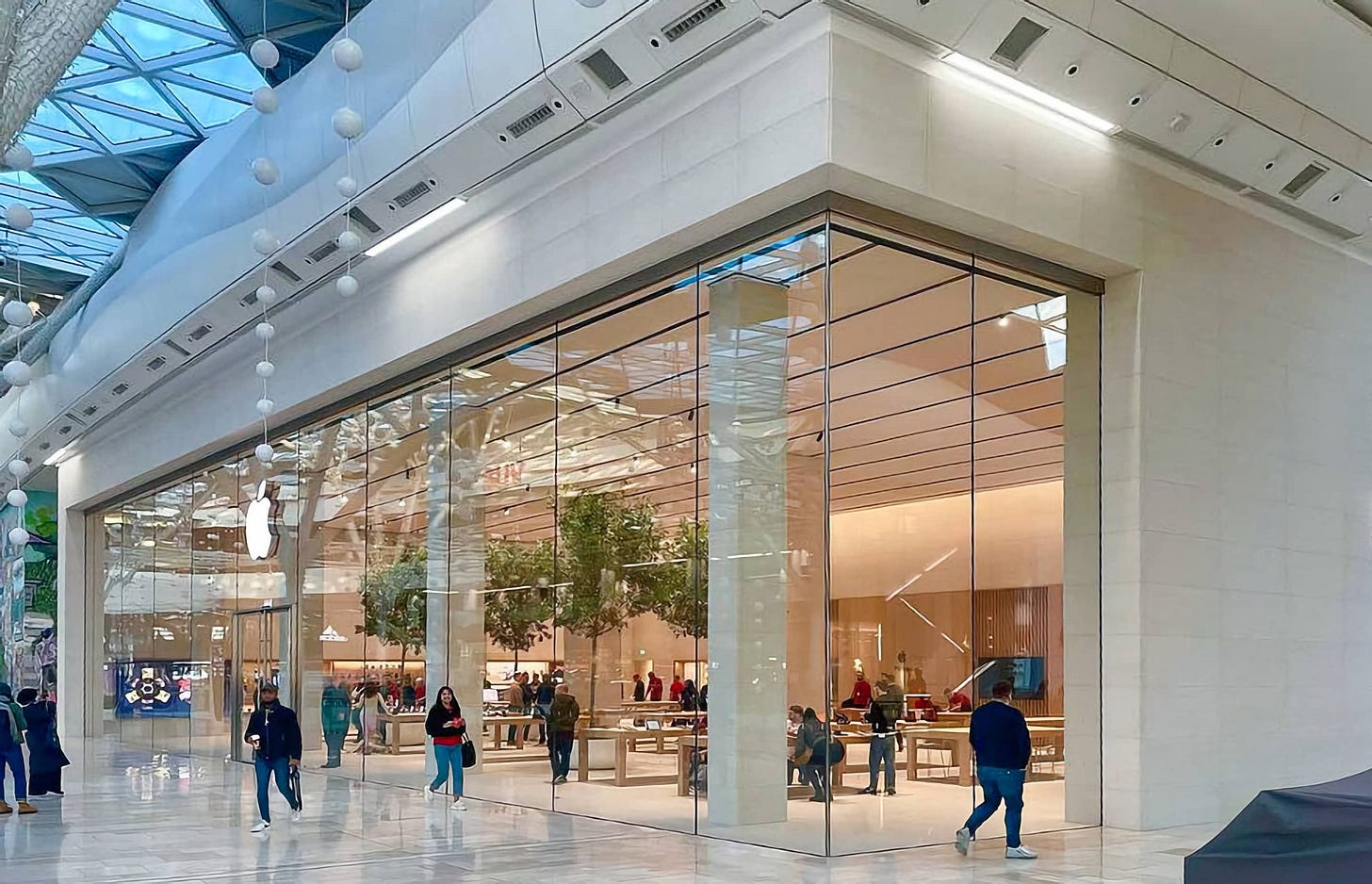
Since September 2021, the store had been operating out of two temporary spaces on different levels of the mall. On the main level was a large, utilitarian Classic Store, and on the ground level was an Apple Express pop-up space with those makeshift white kiosks developed during the early days of the pandemic.
Both temporary stores have now closed, and to my knowledge, there are now no longer any Apple Express kiosks open anywhere in the world. 🎉

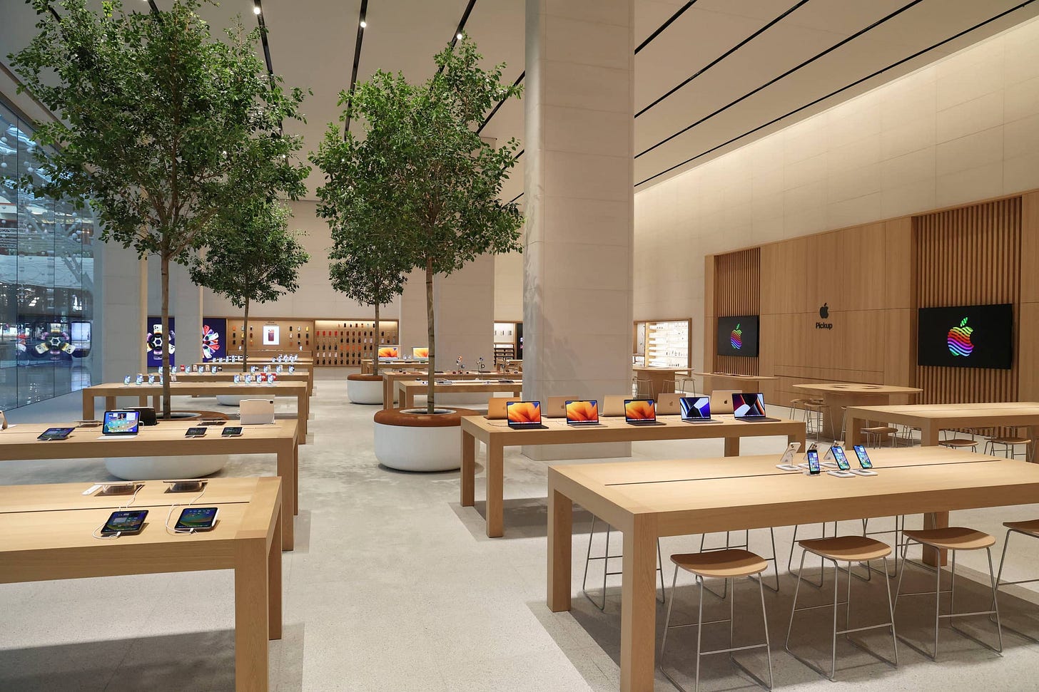
Apple merged the footprint of its original 2008 store with the adjacent corner lot to create a truly massive space. The unique and unusual glass over stainless steel layered storefront has been cleared away for ceilings twice as tall (21 feet) as before.
The new Apple White City features a design so unprecedented to me that I’ve been struggling with how to classify it in my app, Facades. The store meets most of the criteria for both a New Store Design and Vintage D.2 store, but all of the criteria for neither. Let’s look closer.

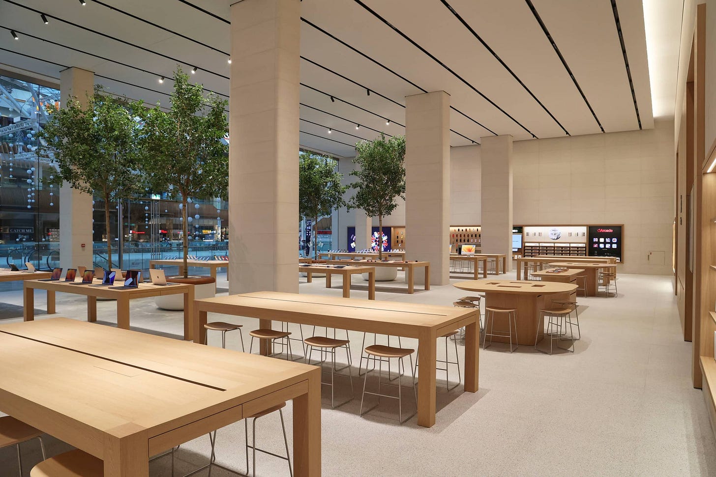
There are limestone walls, recessed Avenues, and indoor trees with integrated seating — all hallmarks of the New Store Design era. Missing are a Forum, Video Wall and plank or LED ceiling panels.
There is also a dedicated Apple Pickup area in the rear center of the store (appearing here like a drop-in Video Wall replacement), two smaller Today at Apple displays and tables, and a suspended ceiling made of acoustic fabric — telltale features of the latest stores. Missing are freestanding Avenues, acoustic fabric walls, and an inconspicuous storefront.
These design elements aren’t individually novel — this doesn’t feel exactly like a new type of store — but they’ve never been combined in this way.

Remember a few weeks ago when I said that Apple Pacific Centre felt like the curtain call to an era of store design that began in 2015? If we extend the metaphor, Apple White City feels like a suspenseful scene change during live theater. The old set is being cleared.
Today at Apple India
In-person Today at Apple sessions are coming to India for the 2023 India Art Fair beginning February 9th. It’s been more than two years since online sessions and the Apple Store Online came to the country. This is another positive sign that India’s much-delayed physical stores might be almost ready. The only thing missing is support for India in the Apple Store app.
Featured image
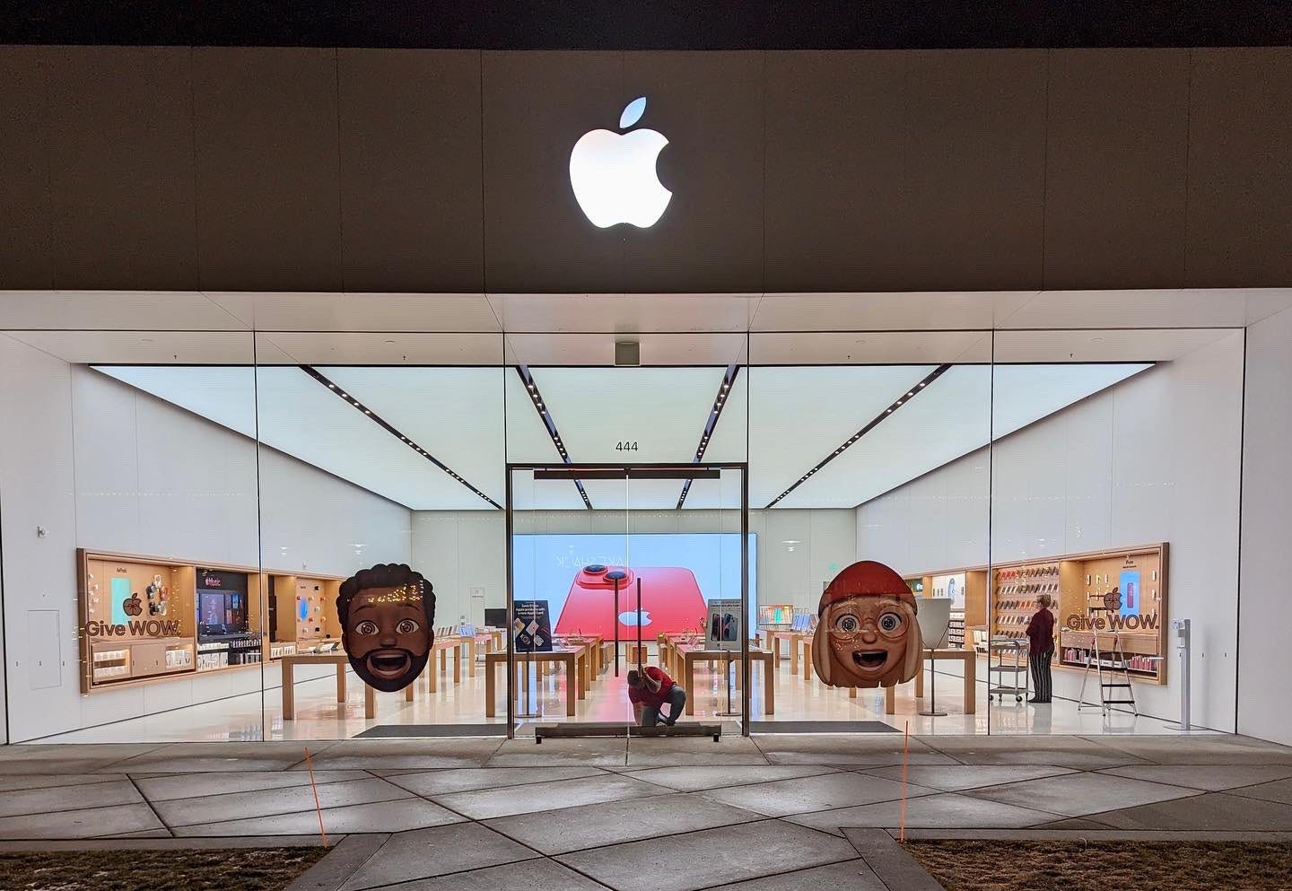
Apple Hilldale
Photo via AlphaGraphics Middleton.

