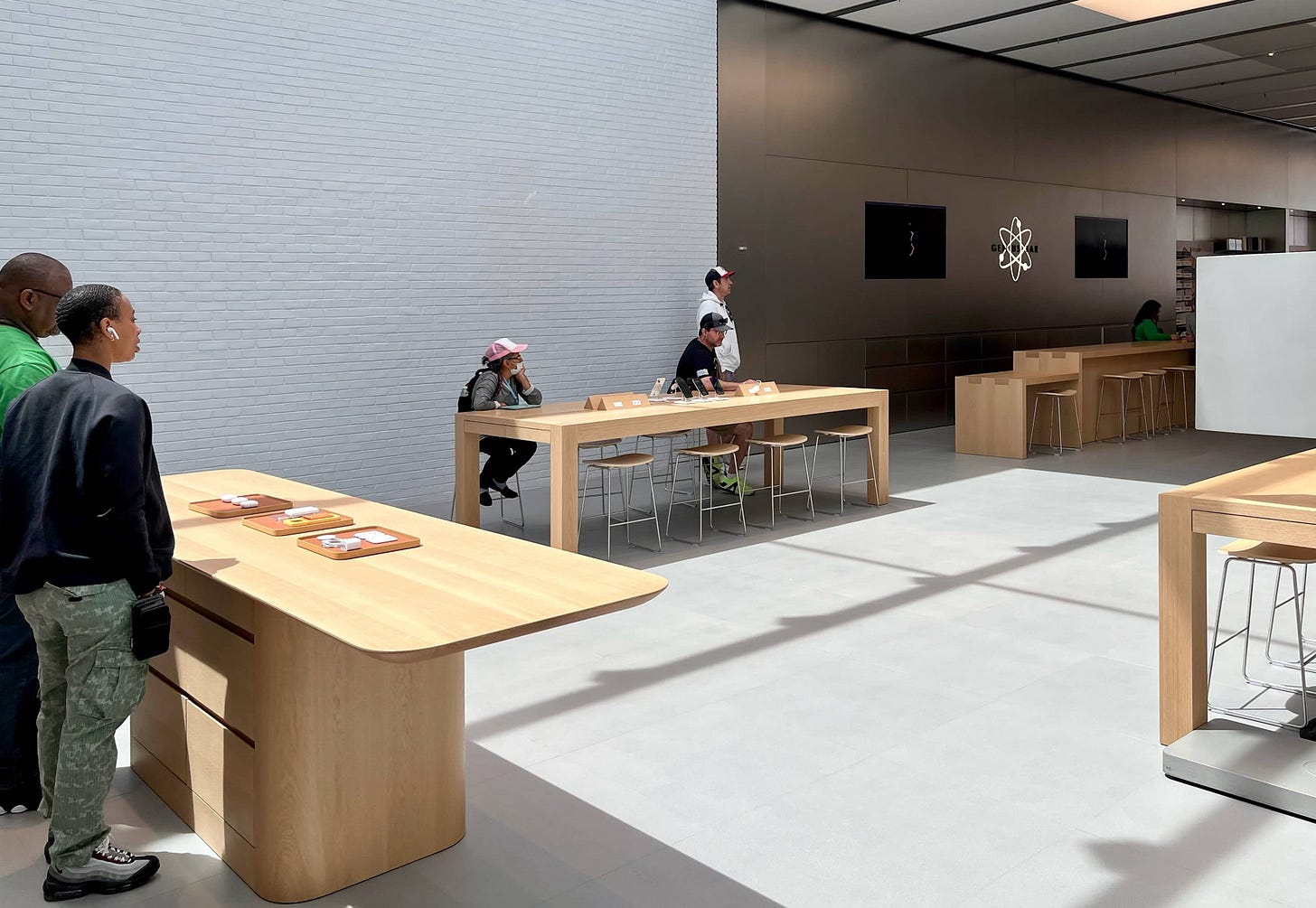
Earlier this spring, we extensively discussed the future of the Forum in Apple Store design. To mark the recent sixth anniversary of Today at Apple, I’d like to take a deeper look at the evolving role of education in the retail experience. Ideas revealed at Apple Tysons Corner demonstrate a symbiotic relationship between session content and store architecture.
To understand Apple’s approach to in-store education first requires an understanding of the spaces Apple is creating to educate in.
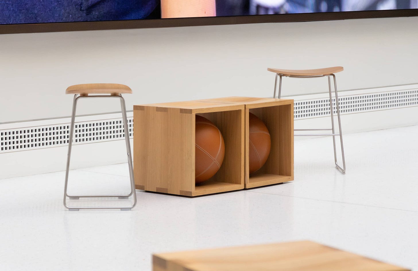
At Tysons, the far left corner of the store nearest the large graphic panel is set with a single Today at Apple table. It’s one of the new low tables with matching low stools. It’s the only table in the store with a cutaway section on top containing speakers and USB-C ports. At the head of the table is a refreshed Forum display with an improved panel.
It’s wrong to call this area an afterthought — Apple redesigned every Today at Apple fixture in a meaningful way for this store — but diminished? Perhaps. Others seem to be noticing, too. During a selfie moment at the Tysons opening, I was surprised to overhear a customer ask Deirdre O’Brien if Today at Apple has a future given that the store has no video wall. Tabletops readers have expressed similar concerns. (The answer, of course, is yes. Education has been a key part of Apple Retail since day one.)
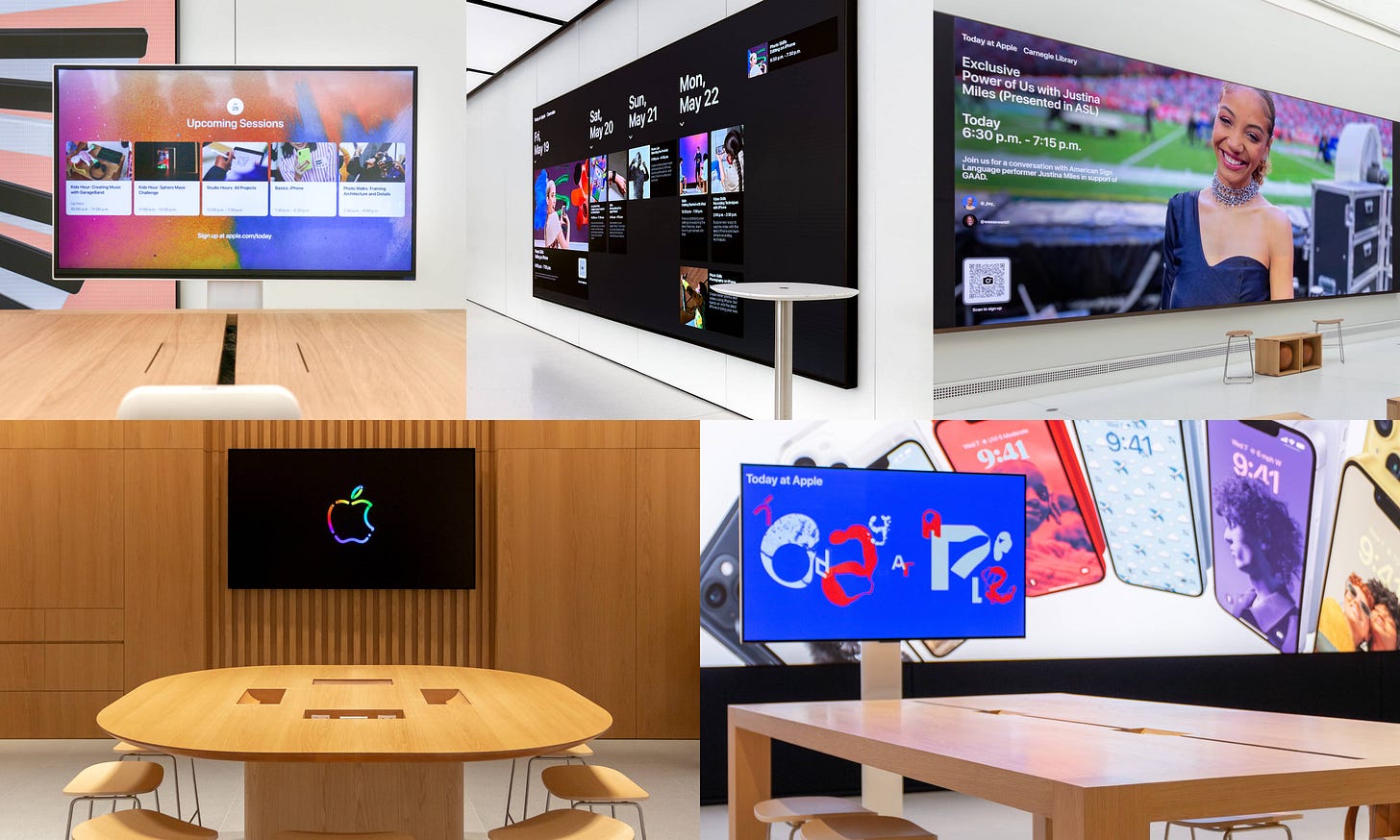
Attending a session at a high profile store like Apple Michigan Avenue is often a cut above your local mall in both content and environment, and I think people intuitively expect that. But today, there’s a growing material difference between the session experience even across mall stores, and that might be where uncertainty begins. There are now five distinct Today at Apple environments:
Single Table: One table, one Forum Display, a Beats Pill+, stools
Standard Forums: Video wall and cube seating
Significant Forums: Exclusive events, grand spaces, top Creative Pros
Roundtable: Two round, high tables, two larger displays, stools
Tysons Corner: One new low table, one new Forum Display, stools
There are several conclusions we can draw here. After ramping construction in 2015-6 and launching Today at Apple with great ambition in 2017, Apple has gradually reduced the amount of space dedicated to sessions in new store projects. If you look at the list above, the session experience at Tysons Corner most closely resembles that of stores built before Today at Apple launched. Classic Stores still make up a very slim majority of all Apple Stores, so this is hardly a break from the status quo.
The new low table design and updated Forum Display both appear to be compatible with existing stores, so I wouldn’t be surprised if Apple slowly begins to add these fixtures to older locations. The Beats Pill+ that Creatives depend on was discontinued 16 months ago, and Apple will eventually run out of replacements, right?
Concurrent with the reduction of square footage dedicated to sessions is a pragmatic streamlining of the session calendar. There are noticeably fewer Labs and Tours (formerly Walks) and more Skills sessions offered than before. Limited-run “Pop-Up Studio” sessions offer a low commitment way to drop in for a session without registration. More broadly, Today at Apple now encompasses community outreach programs like Creative Studios that take place primarily outside the store environment.
After several years of iteration and artist collaborations, Apple appears to have landed on a simplified lineup of sessions that focus on the basics. So many customers still find incredible value in simple tips that improve their lives every day. I’d wager that this same customer demographic is much more likely to visit a physical store for help than more experienced users, who might first check online. Skills sessions seem to work best in small, personal groups, so sessions at all stores are most often held at tables. If Apple brings the new fixture set from Tysons to most of its existing stores, the result would be an essentially unified experience for most customers.
The outlier for both customers and Creatives is the roundtable session format found only at Vintage D.2 stores. In many ways, this design offers the best compromise between the immersive Forum and a standard table. The displays are larger, the setting is more personal, and it’s easier to find. It’s a space suited for more types of sessions. I find it strange that this design is so far primarily a feature of smaller and more cost-efficient stores.
Synthesizing all of this data suggests to me that Apple’s values haven’t moved. The fact that Apple continues to tweak the Today at Apple experience rather than eliminating it demonstrates that. The Apple Store of tomorrow reminds me a bit of the 2021 Touch Bar-free MacBook Pro: a return to form. Every recent retail change ultimately addresses how the stores are actually used and seeks to optimize real, demonstrated needs of customers. It’s now on Apple to reassure the community that its commitment to education is unwavering.
Freehold Raceway Mall
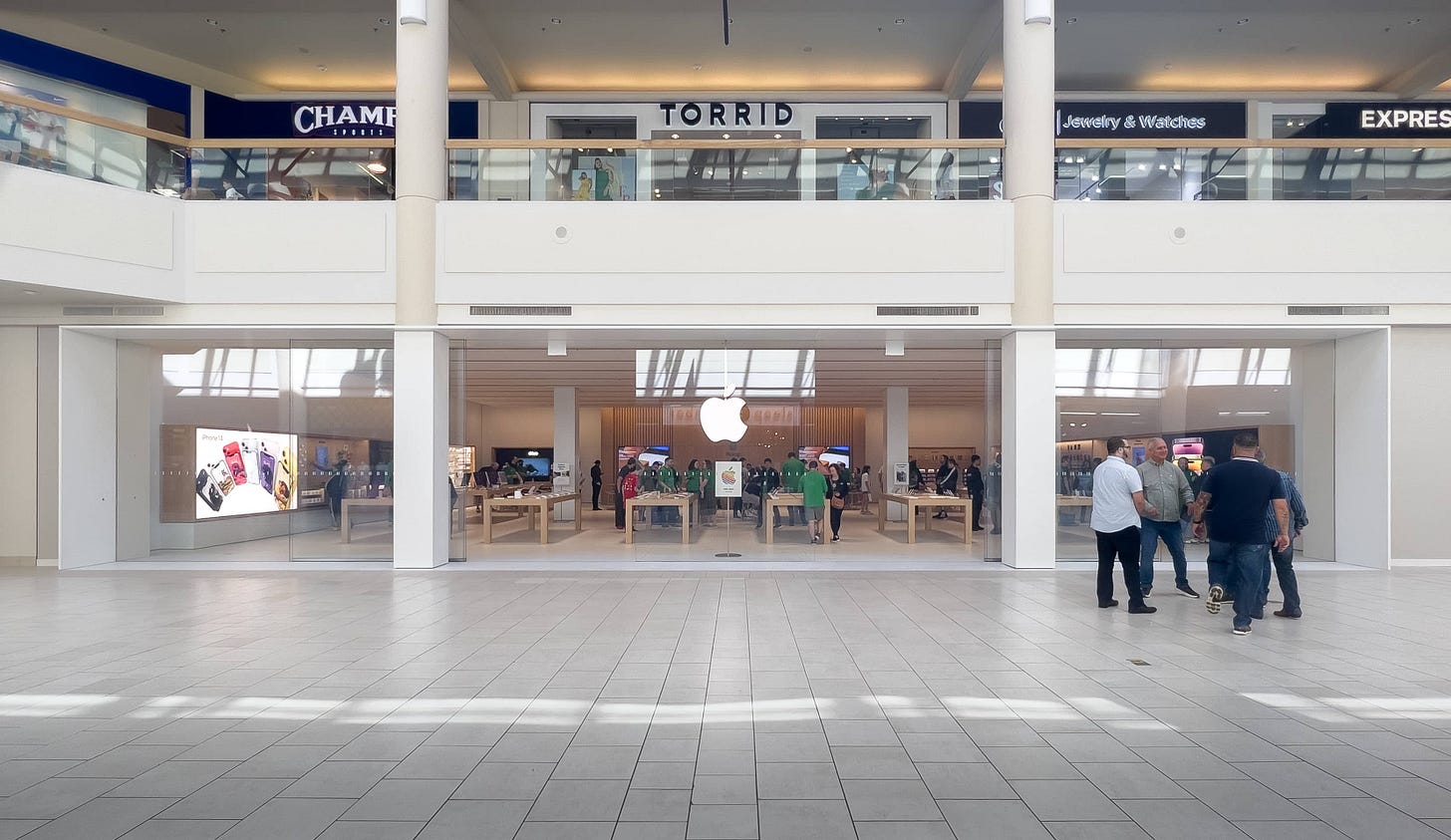
Apple Freehold Raceway Mall in Freehold, NJ celebrated its reopening on Saturday. The new space is located just down the hall from the original location and is approximately triple the width. You’ll notice this store doesn’t have a Genius Bar, new Avenues or any of the other designs introduced earlier this month. Going forward, I expect we’ll see Apple choose between a few recent design styles based on the needs and expectations of the store.
Georgetown
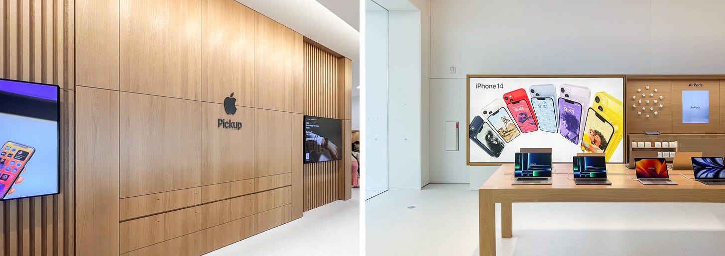
D.C.’s Apple Georgetown also reopened on Saturday with a very surprising addition: a dedicated Apple Pickup counter. That makes this location the first Classic Store to receive pickup fixtures.
To add a counter to the skylit atrium at the back of the store, Apple removed two large LCD displays from the back and right walls and several older tables. The displays were used for Workshops back in 2010 but eventually became obsolete. There’s now a freestanding credenza behind the counter and pickup signage on the back wall.
The unique layout of Apple Georgetown makes it difficult to glean how Apple might add pickup areas to other Classic Stores in the future. The Genius Bar is located on the side walls, and the back of the store is finished with brick, not stainless steel.
Featured image
Apple West 14th Street
Photo via @bdub.jpg.

