The iPhone 15 and 15 Pro launched in South Korea on October 13, and Apple had one more color takeover waiting in the wings. On Friday, the windows of Apple Myeongdong came to life in Seoul.
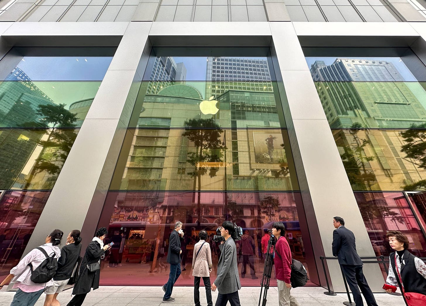
In addition to the colors, the store received iPhone Spotlight Tables. In other countries, launch season is winding down and the window takeovers have been removed.
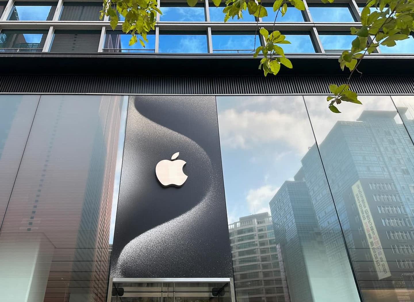
At Apple Gangnam, Apple replaced a colorful banner over the store entrance, which had curiously remained in place since the store’s grand opening, with a graphic that matches the iPhone 15 Pro wallpaper. To my knowledge, it’s the only store with such a detail.
Chile
In case you missed it: The Apple Store Online opened today in Chile, and Apple prepared wallpapers for Mac, iPad, and iPhone. You might recall that the online store also opened in Vietnam earlier this year. Neither country has a physical Apple Store, but the online infrastructure is a critical first step to making one possible.
India
On October 15, Apple launched a festive offer in India. The Apple Store Online and matching homepage are worth taking a look at for their graphics and animations even if you’re not in India. Some special Today at Apple sessions have been prepared for Apple BKC in Mumbai.
Google Visitor Experience
Last week Google opened the Google Visitor Experience in Mountain View, California. Think of it like of Apple Park Visitor Center (Google’s Version). There’s a cafe (with an online menu), a community space, a pop-up store, and even an orb to ponder.
I think it’s fantastic when other tech companies try their hand at retail spaces, and I applaud Google’s thinking here. There are certainly some ideas at the Google Visitor Experience I wish Apple would reinterpret. But look: this is a newsletter about Apple Stores. We’re allowed a little bit of fun.
If you head to Mountain View, watch for the upcoming Today at Apple sessions Google is offering, and make sure to spend some time on The Plaza, which offers seating, public Wi-Fi, a 50-foot tall “green wall” and regular acoustic performances will host music performances, art tours, outdoor yoga sessions, and more throughout the year.
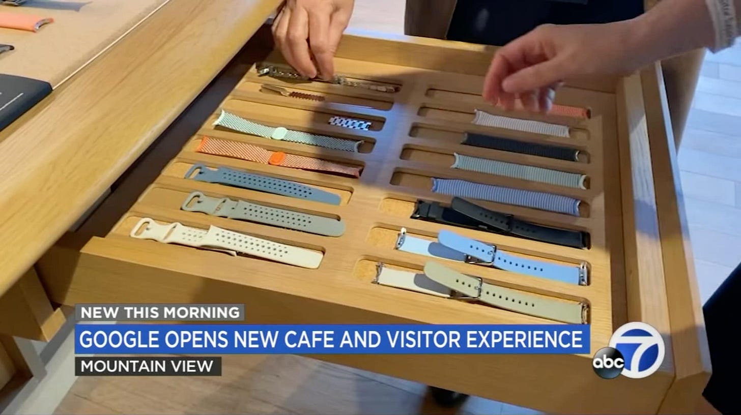
And of course, the Apple Watch try-on tables at Google Visitor Experience are filled with bands for you to try:
I’ve been spending the majority of my free time over the past few weeks working on some updates to Facades that I think you’ll find are worth the wait. Tabletops readers are some of the most active users of Facades, and I value your input. If you ever have feature suggestions, data corrections, or bug reports, please let me know. I’ll soon be opening the Facades TestFlight group to a larger pool of testers, so if you’re interested in providing feedback on the beta, drop me a line.
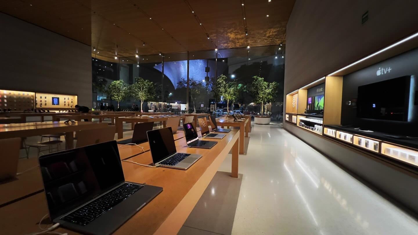
Featured image
Apple Antara
Photo via @the_maseosare.


I am glad the Google visitor center store aligns with their Williamsburg neighborhood store design language. And their modular display shelves is so smart and might become the new "Avenue" of future stores.
For feedback, I highly recommend a post in the future talking about Apple's approach across retailers. Their refreshed design at Best Buy NYC (nothing like existing apple store design languages) and Vintage D.2 themed shop in shop at Target since 2021 are fascinating to see! Each represents a totally different strategy! Would love to see your take!
One input on FACADE: currently we have info on when store "opened" and "moved", would also love to see info on store design evolution: when remodeled and changed design language.