Apple Jing’an illustrates the idea that good things take time. Years have slipped by since rumors of this store first appeared. Other stores have opened and closed in all corners of the globe, an entirely new retail design language materialized, and the world emerged from the pandemic while Jing’an Temple Square sat dormant. This week, spring arrives. It was worth the wait.
At this point, the subterranean store is a time-tested format that Apple seems to love. We saw it first nearly 18 years ago at Apple Fifth Avenue, then again at Apple Pudong, Shanghai’s first store. It worked at Zorlu Center, Jiefangbei, Kunming, Piazza Liberty, and Xinyi A13.
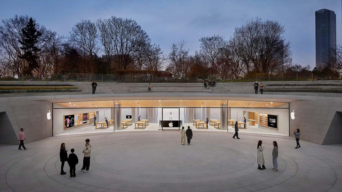
The formula has remained the same: a sense of mystery is conveyed through a dramatic architectural landmark that invites you to explore the store below. Once inside, the mystery gives way to the familiarity of the Apple Retail experience. At Jing’an, it’s a bit different. The store entrance is so minimally expressed within the landscape that it’s easy to miss. One low wall of the circular plaza opposite amphitheater seating — practically hidden from the view of passersby — is glazed with a panoramic strip of curved panels and bookended by two small Apple logos.
It’s only after passing through the portal that the magnitude of the store is revealed. Much deeper and taller than the plaza suggests, entering Apple Jing’an is a bit like discovering a glimmering cavern on a walk around a bluff face. The familiarity of the Apple Retail experience collides with the mystery of a dramatic architectural landmark… underground.
Let’s start at the plaza level.

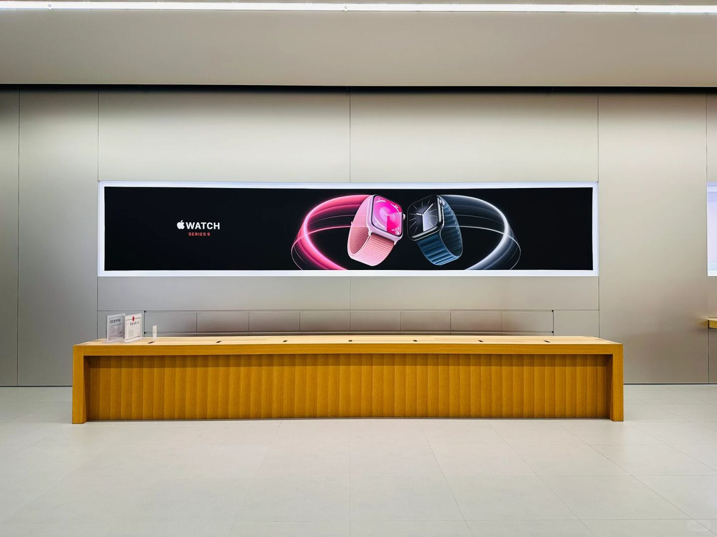
Twelve tables fill the long and narrow floor adjacent to the store entry. Three ten-foot Avenue bays and a graphic panel line the left wall. Next to the Avenues, a passageway leads to the Boardroom and a stainless steel elevator to the Forum level. On the right, another bay and graphic panel share the wall with an Apple Pickup alcove. This is a great time to address the store’s design style.
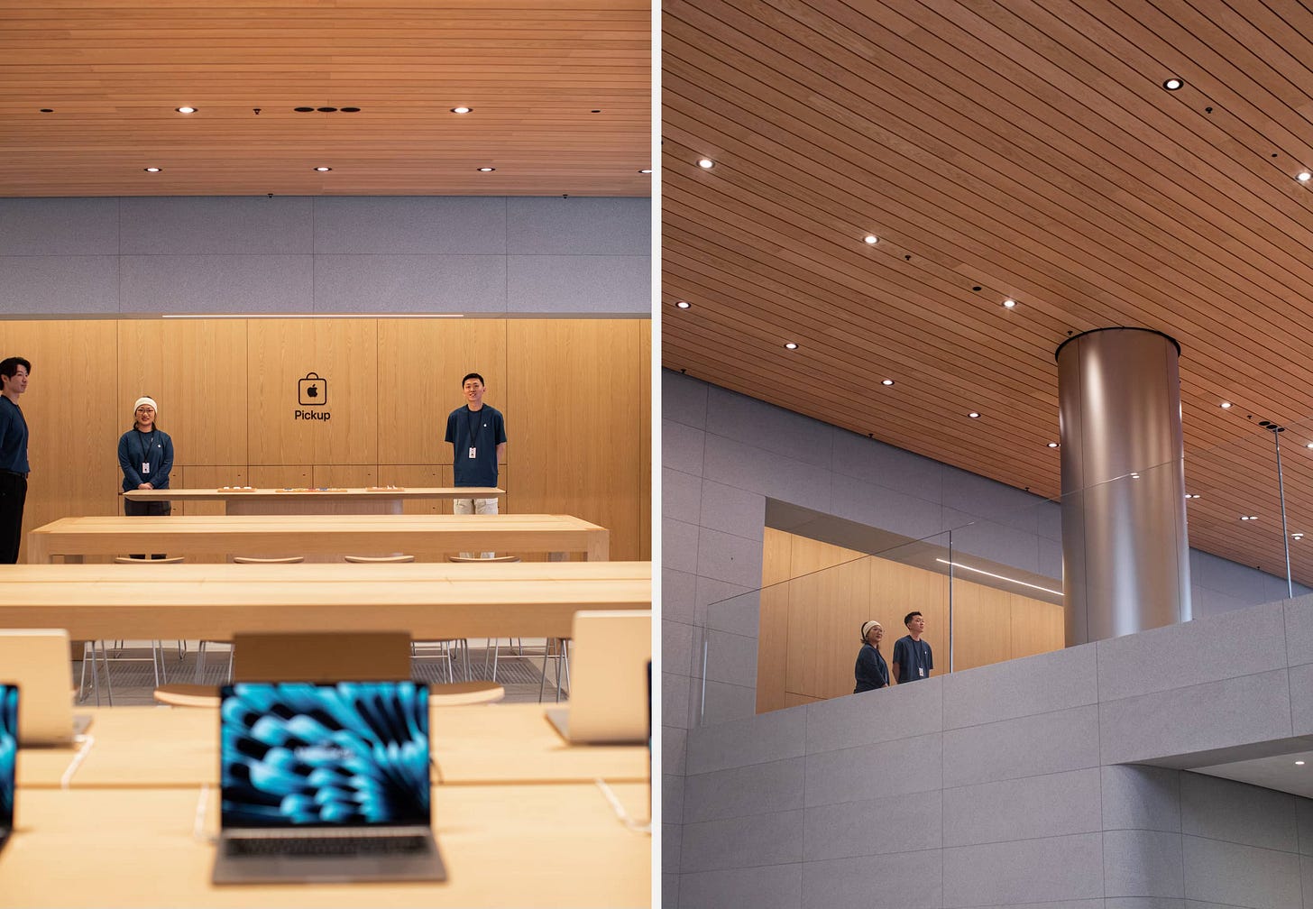
Apple Jing’an spans three generations of Apple Retail design. The project was first organized during the Vintage D era, and most of the store’s material finishes reflect that timeline. Over the intervening years, the plans were undoubtedly revised dozens of times as Apple’s strategic and environmental goals evolved. The result — as with so many store projects these days — is a bit of a hybrid design. Fundamentally, I believe Apple Jing’an presents a slightly outdated set of Apple Retail design ideas, but that doesn’t mean I don’t love it.
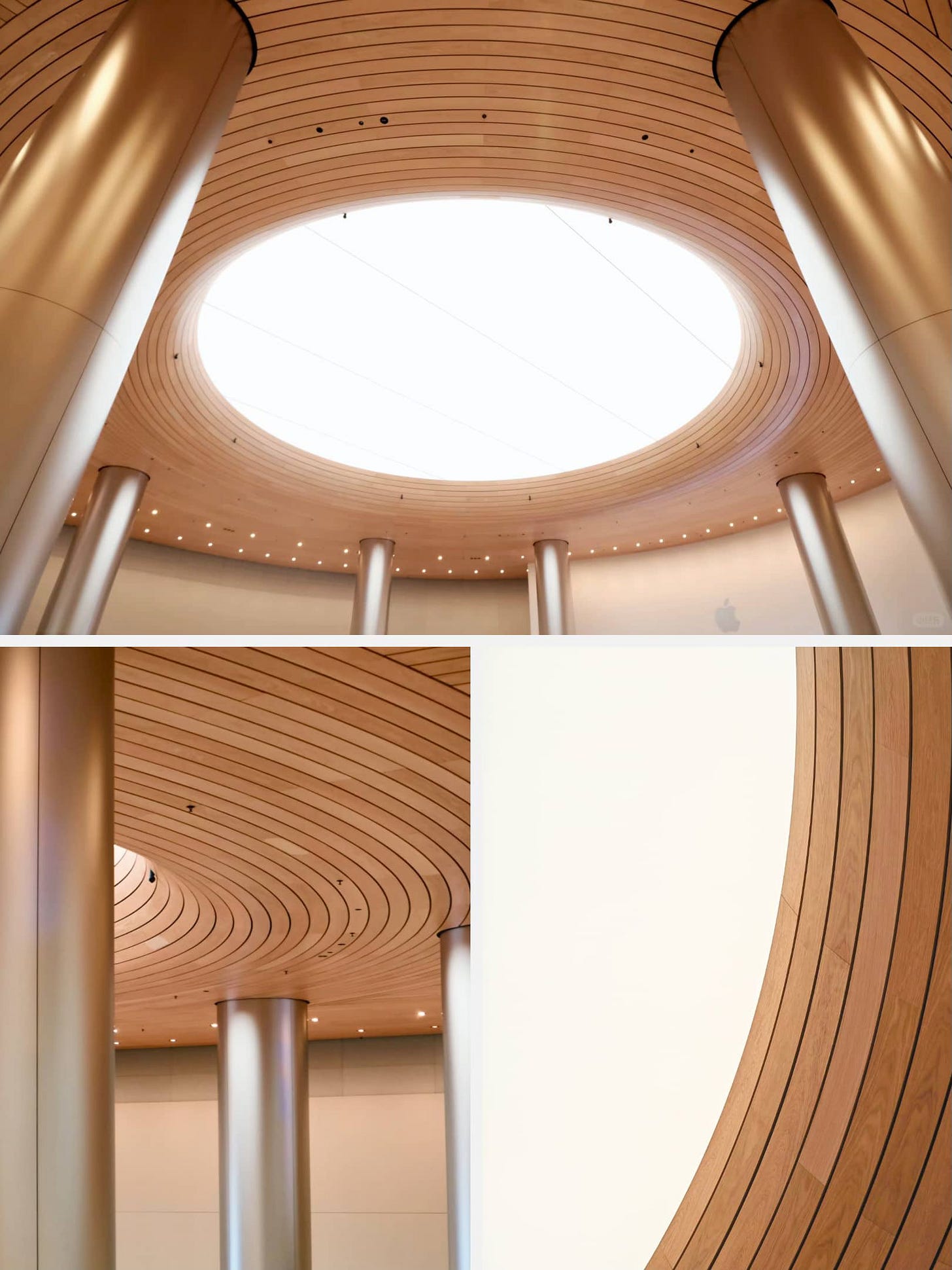
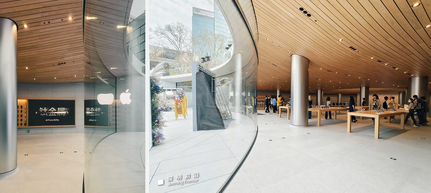
A one-of-a-kind curved wood ceiling system swoops down from the store entry. The wood panels form dynamic lines that shoot toward the center of the store and guide the eye to a mesmerizing “oculus” that floods the store with light. This isn’t a proper skylight, but the huge, color temperature controlled luminous panels effectively create the illusion of daylight in a subterranean store. Around the perimeter of the oculus, the woods panels radiate in a concentric pattern, doubly-curved as they bend toward the apex.
To fully appreciate Apple Jing’an, it’s helpful to consider a few of the significant design challenges a subterranean, circular store of this height presents.
The wood ceiling is composed of wood panels interleaved with a structure of troughs that contain the primary lighting for the sales floor. In most stores, these components are somewhat standardized and modular. On a curved ceiling, Apple can’t just use off-the-shelf parts — not even off their own shelves.
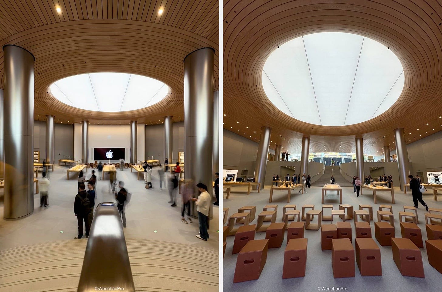
With a ceiling this tall, light loss is a significant concern. The oculus isn’t just a cool visual element, it’s an absolutely necessary solution engineered to mitigate a tricky obstacle. Tables on the Forum level, which are partially arranged in a circle, include lamps to supplement the ambient light.
Stairs with arcing treads just inside the entry guide visitors to the lower level and its massive circular Forum. The Forum’s stone floor pattern is cut to match the circular shape of the store, and the video wall is anchored on a curved plaster wall below an Apple logo.

The Forum level walls are curved Padang Light stone, so Apple needed to fabricate one-off curved Avenue trim to match the contour of the wall! Above the Avenues are large acoustic panels.

Visitors can enter Apple Jing’an through a second entrance in the Shanghai Metro. The entrance itself is quite unique, diverting foot traffic in two directions through the use of a curved stone wall concealing the stairway above. Two ramps ascend into the store, where visitors immediately face the Forum.

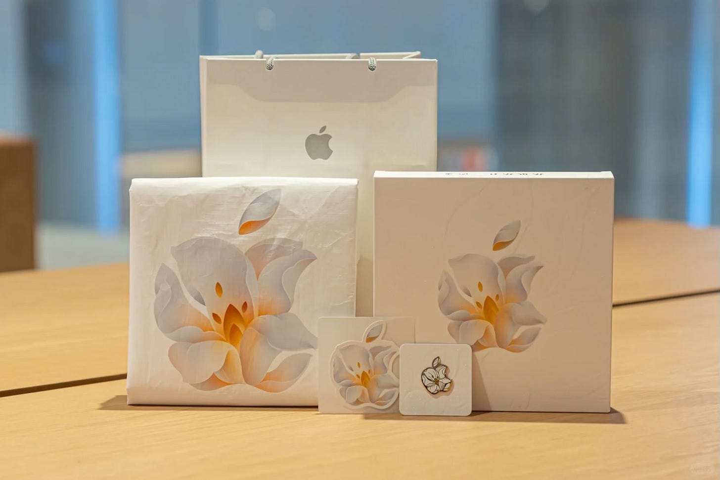
Apple Jing’an opens on March 21 at 7 p.m. Opening day visitors will receive a tote bag and pin. To see the store from more angles, I recommend this YouTube video and this clip on Weibo, which appears to be sourced from Apple’s video team.
Sidenote: Apple removed the line stating Apple Jing’an is “Apple's second largest global flagship store, second only to the flagship store on Fifth Avenue in New York.” from the store’s official Apple Music playlist description. I think it was an honest miscommunication. No matter: the store design speaks for itself.
Square One

An all-new Apple Square One opens March 23 at 10 a.m. in Mississauga, Ontario. The store is relocating to the Level 2 center court, next to Levi’s. Apple has partially revealed the new facade, which features large, curved glass panels. The original Square One store opened in August 2009, and this is its first major upgrade. We’ll take a closer look when the store opens. If you attend the opening, I’d love to see and share your photos.
(By the way, did you know you can also send me photos anonymously?)
Shinsaibashi completed
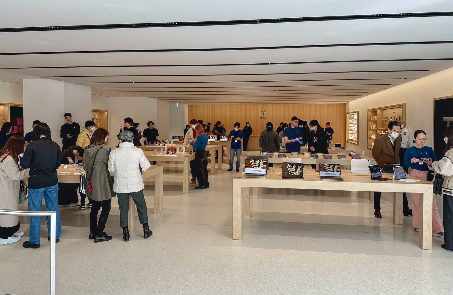
The lower level of Osaka’s Apple Shinsaibashi reopened on March 9 after closing last December. The construction was part of a larger renovation project that began in late August 2023. Now complete, the renovation has significantly transformed the store from its original appearance, complete with wood floors and a Theater, to a modern Apple Store with Avenues, Apple Pickup, terrazzo floors, and a fabric ceiling.
The ground level now mirrors the store’s completed upper level. At the back, a pickup counter fills the space of the Genius Bar upstairs. There’s a new rear exit with glass doors.
Apple has retained two key features of the original store. Preserved is the spiral glass staircase and bridge, the store’s signature design element. Also unchanged is the large stainless steel facade and outdoor graphic light box.
To see more photos, visit Mac Otakara.
Featured image
Apple 解放碑
Photo via Grandé.


