Apple Hanam opens
A look inside the sixth Apple Store in South Korea.
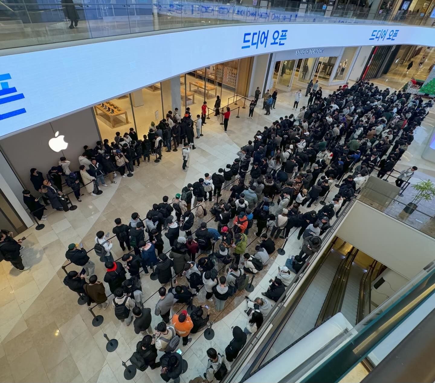
Apple Hanam opened on Saturday in South Korea to a generous crowd. According to a friend at the opening, more than 200 visitors were already in line by 7:30 a.m., two and a half hours before the doors opened.
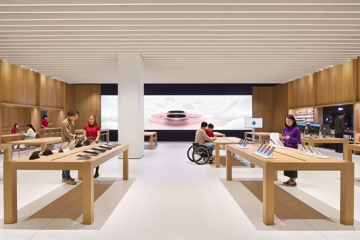
Apple didn’t publish a press release for this store, but a gallery of official photos that beautifully illustrates the space was shared with local media:
Apple Hanam brings Apple’s new universal design principles and greater sustainability goals to South Korea for the first time. This is especially evident in the floor plan of the store, which is punctuated by three large structural columns. In older stores, these columns may have been navigation obstacles, creating narrow paths between tables. At Hanam, Apple chose to sacrifice entire product tables and maximize floor space.
South Korea is a particularly interesting place to study Apple Store design because the country now has at least one store that spectacularly represents every significant Apple Retail design revision in the past decade. Perhaps nowhere else can the timeline be expressed so succinctly:
With Vintage E stores beginning to multiply, the rewards of modularity are becoming evident. As was first noted on Weibo, the two press images below from Apple Hanam and Apple MixC Wenzhou appear almost identical even with close inspection. It’s these kinds of shared experiences bridging across the world that make Apple Stores feel so familiar no matter where you are.
If you’d like to see a detailed walkthrough of the entire store, I recommend this YouTube video.
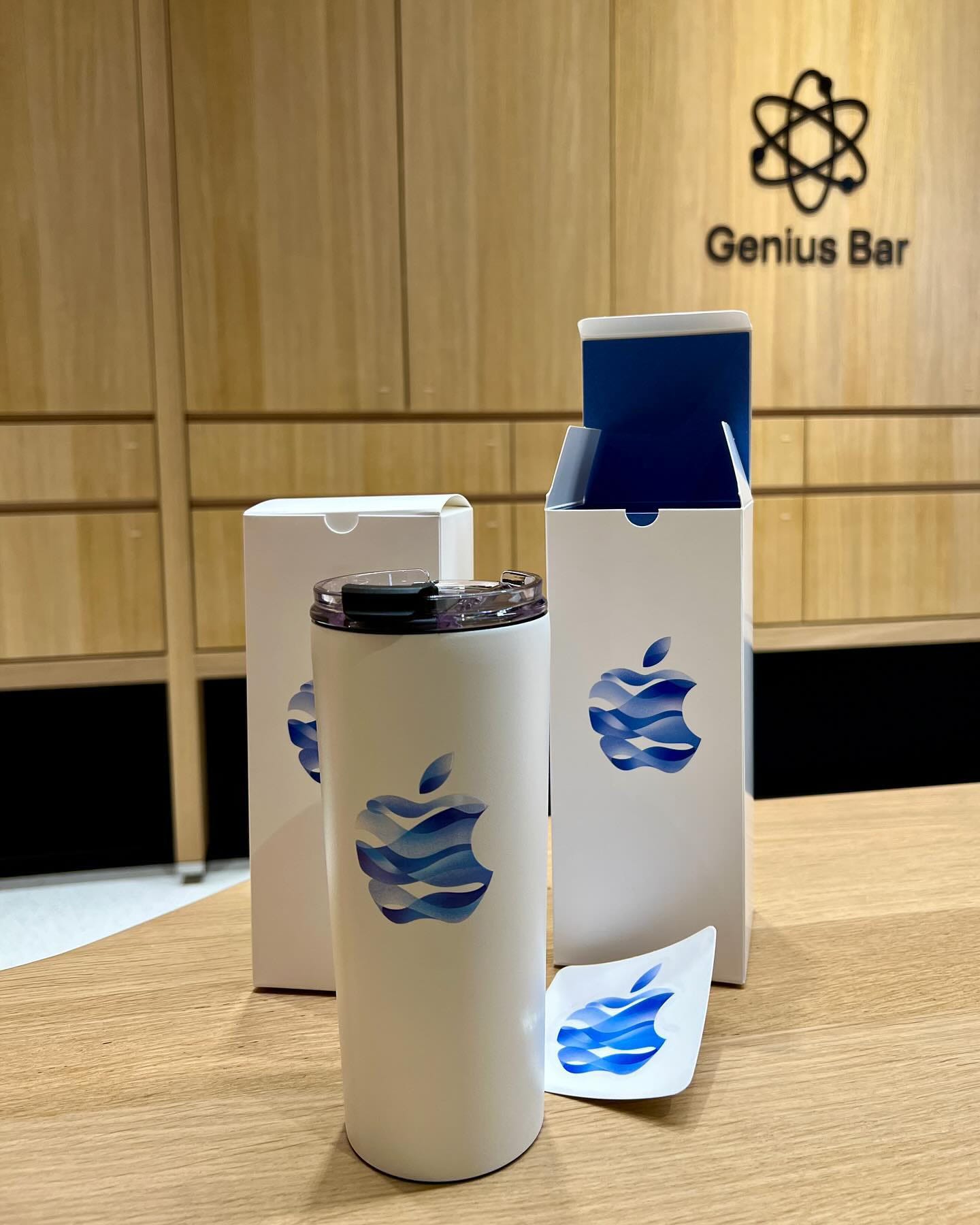
On opening day, customers received a boxed tumbler and a sticker with the Apple Hanam logo. I have some questions about the sustainability angle of a tumbler with a plastic lid versus something like a fabric tote bag, but it is a souvenir first for any Apple Store and quite fitting for the chilly holiday season.
The Apple Hanam logo also took over a digital marquee that wraps the perimeter of the mall at level two. Likewise, Apple used the massive video pillar in the mall atrium to celebrate the opening. I’d love to know what resolution that logo was rendered at.
Shinsaibashi’s new look

In Japan, the upper level of Apple Shinsaibashi reopened on December 8 following a renovation that began in late August. The new look is rather remarkable.
In a design first for any location, elements of every store style have been combined to create a new type of hybrid store that I truthfully have no idea how to classify in Facades. (If you know, you can always message me anonymously.)
At the back is a wood wall with a new Genius Bar in a similar style as Apple Hanam. The ceiling matches the fabric panel design found in stores like South Shore. The Avenues are set into the walls like those found in older stores. The floors are terrazzo. To top it all off, the classic glass staircase and its stainless steel stairwell remain.
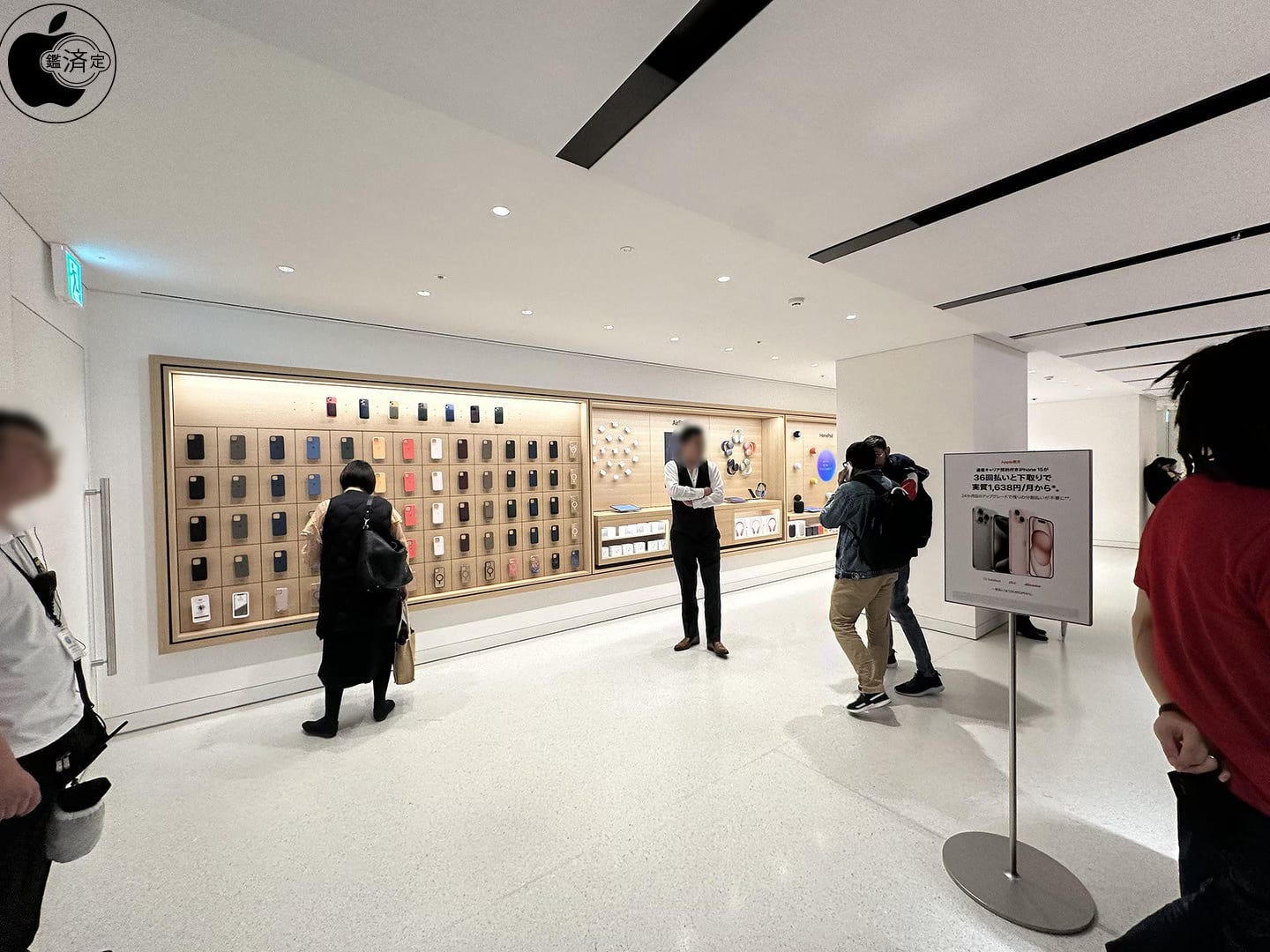
Together, these elements all blend remarkably well and I don’t suspect most customers will find the appearance anywhere near as surprising as you and I might. And the surprises are not over — level one still needs to be renovated and is under construction now. I expect this area could have an Apple Pickup counter that mirrors the Genius Bar.
It was a bit sad when the last Theater disappeared, but this new look is more than a worthy successor. For more photos, visit Mac Otakara.
Featured image
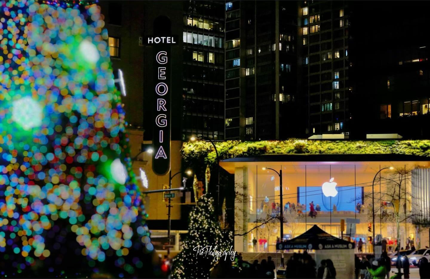
Apple Pacific Centre
Photo via @pie.photography.yvr.

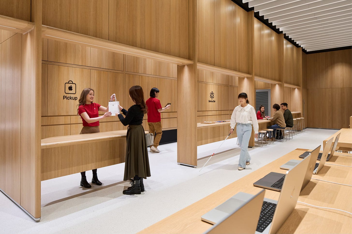


I would say Shinsaibashi is a Vintage D.2 based on its ceiling material.