The big demo
The launch of Apple Vision Pro is Apple Retail at its finest.
Without Apple Retail, I’m not convinced Apple Vision Pro could work. Don’t get me wrong: the device could physically exist, but it would have no product story, no voice. It couldn’t capture the hearts and minds of the public. Think about it: people understood portable music players before the iPod, cell phones and touchscreens before the iPhone, iOS devices before the iPad, and watches before the Apple Watch. How many people do you know that own VR headsets?
Compared to other new platforms, Apple is relatively early to the spatial computing category in a consumer context. In addition, Apple Vision Pro is intensely personal, much more so than even the Apple Watch. Trying your buddy’s Vision Pro is more like trying on their shoes than playing with their iPhone: it might work if you’re the same size, but it’s going to be awkward and maybe even a little bit gross.
All of this makes a great demo absolutely critical. That’s mostly new ground for Apple. Even the Apple Watch demo experience was essentially a more sophisticated and personal way to try the product and explore band options. Today, it’s not even possible to walk into an Apple Store and hold Vision Pro without an appointment.
Friday, February 2 was a make or break moment. Apple moved mountains to coordinate demos across 271 U.S. retail stores. This launch impacted every facet of the store experience both customer facing and internally. I think it paid off.
Today I’m going to discuss the Vision Pro demo experience from end to end in extreme detail. This post is long, so I’ve divided it into three parts: the demo, the fixtures, and the special Demo Zones. I’m not going to review the actual device in this post; there are plenty of others covering that ground. If you’re reading this as an email and it’s been truncated or would rather read on the web, click here. Let’s get started.
New to Tabletops? Subscribe for updates delivered every week.
The demo experience
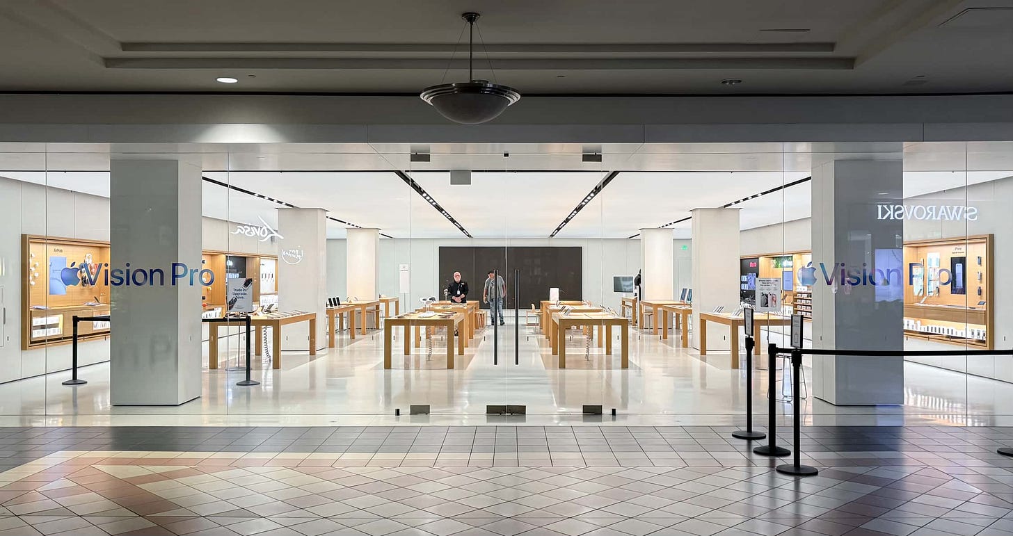
I visited Apple Mayfair for my demo appointment. This location doesn’t have a special Demo Zone, which makes it representative of the experience found at the vast majority of U.S. Apple Stores today.
When I arrived at the store, an employee signed me up for an 8 a.m. demo appointment. These appointments were available in-person on a first come, first serve basis through launch weekend, but it’s now possible to book a demo on the web or in the Apple Store app.
Shortly after booking, I received a text with a link prompting me to answer some vision questions ahead of time. The link launched the Apple Store app, where I was guided through a brief questionnaire and description of the demo. The app generated a pass to add to Apple Wallet, though I didn’t need to show this as I had booked my demo in line.
Several appointments, each of which lasts 30 minutes, can run simultaneously. I was seated on a new stool (which we’ll discuss in the fixtures section) on the opposite side of a table from my brother, and two more groups were seated at the next table. Larger stores can accommodate even more demos. These demos take place at tables normally occupied with Genius Bar support, so I imagine at some point the appointment opportunities will be scaled back.
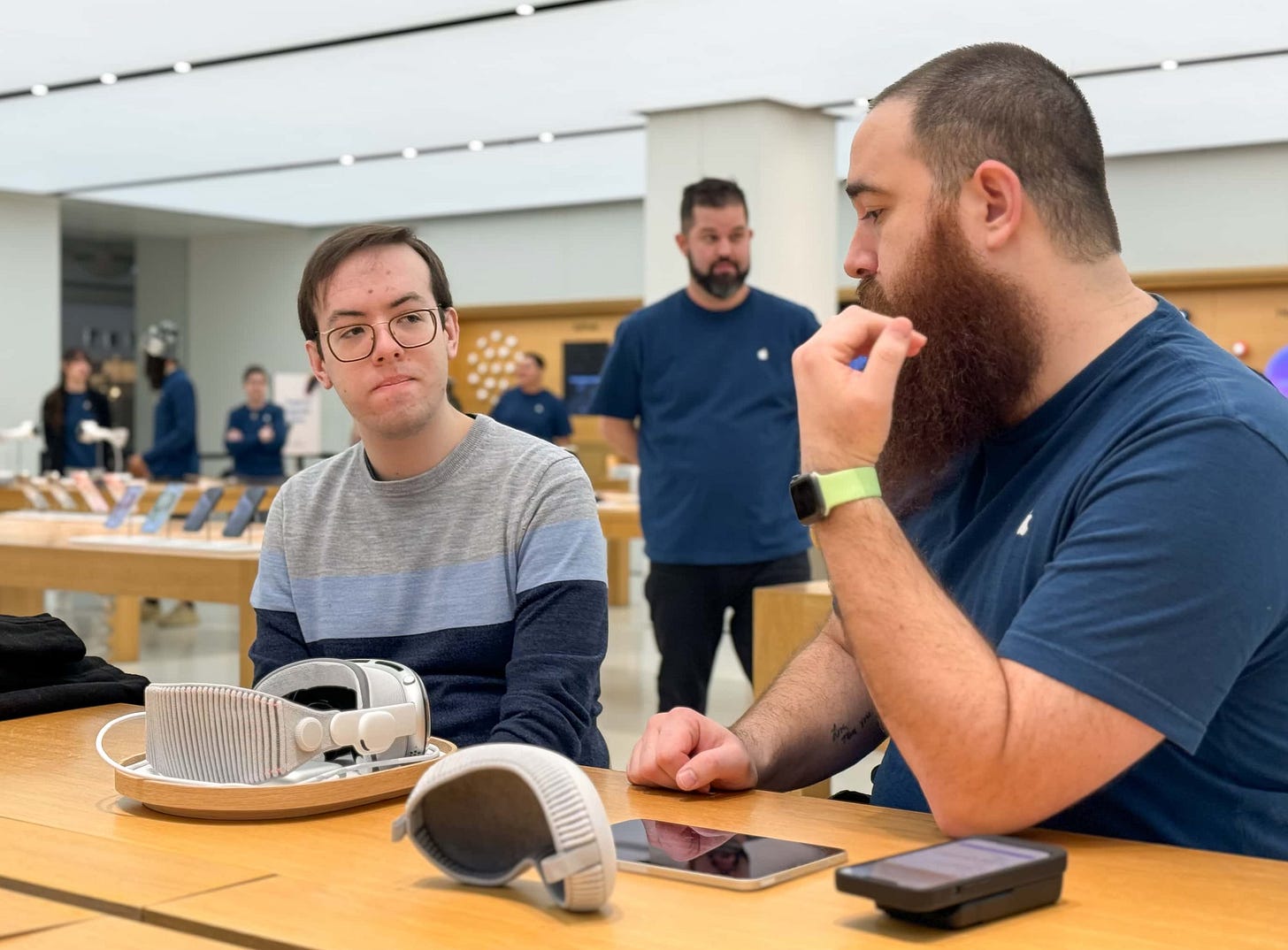
The Specialist hosting my demo handed me an iPhone running a Vision Pro Fit app to determine which Light Seal was right for me. The face scanning process works exactly like the purchase flow in the Apple Store app, which itself is similar to setting up Face ID. My Light Seal “order” was automatically run to Backstage, and in a moment, another employee brought out a prepared Vision Pro on a tray, restaurant style (see the fixtures section below). The Light Seal was fitted with a protective fabric strip that I imagine can be easily replaced between demos when the device is cleaned.
If you wear glasses, at this point the Specialist will ask if they can clean your lenses and run them through a special scanner that reads your prescription and finds the right ZEISS Optical Inserts. More on this in the fixtures section.
Each Vision Pro demo unit is paired with an iPad mini that mirrors the customer’s display and allows the Specialist to control device settings, like the volume. From the appointment registration flow to the fit test to the demo itself, the software magic and in-store logistics for Apple Vision Pro are phenomenal. I had to keep reminding myself that I had the very first appointment on the very first day of sales — the process was so polished.
I had an issue finding the right Light Seal fit, but this wasn’t the fault of the face scan. The Specialist took as much time as I needed and ran new accessories from Backstage. My demo wasn’t cut short, even though it ended up exceeding the allocated time.
Vision Pro is best experienced in-person, so I won’t spoil all the fun of the actual demo here. But if you can’t get to a store or you’re outside of the U.S., here’s an abbreviated version of what happens.
You’re first welcomed with a 3D “hello” floating in space and guided through a brief setup process. An array of dots appears, and you simply look at and tap each one to calibrate Vision Pro to your eyes. You’ll first try the Photos app, viewing regular photos, spatial photos, spatial videos, and panoramas. Next you’ll disappear into an Environment — Mount Hood, for me — and launch Safari. The Specialist will encourage you to rearrange your workspace and open some apps. Along the way, you’ll familiarize yourself with the visionOS interface and gestures.
Video passthrough on Vision Pro is incredibly sharp and works just about as well as you’ve heard, but there is one small, store-specific quirk. Apple Mayfair, like many mall stores, has a luminous, fabric ceiling lit with countless tiny LEDs. There’s a slight conflict between the frequency of these lights and the refresh rate of Vision Pro that results in subtle flickering across the ceiling panels when you look up. You’ve probably seen a more dramatic version of this issue when pointing your iPhone’s camera at certain lights or LED displays. It’s not distracting in visionOS, but it is noticeable and will subtly impact demos at a considerable number of stores. Perhaps this is something that can eventually be corrected in software.
The demo is media, not spatial computing heavy, and its grand finale is a whirlwind of 3D video content. You’ll first watch a trailer for The Super Mario Bros. Movie in the TV app. Finally, you’re launched into a two-minute reel of Apple Immersive Video featuring several 180-degree 3D 8K clips. The reel is stunning and leaves you a bit speechless. That’s where the demo ends, but you won’t want it to. 30 minutes flies by.
The Specialist asked me if I’d like to buy Vision Pro or receive a shopping session recap. The demo is ultimately a sales tool, after all, but it doesn’t feel like it. If you choose the session recap, you’ll see a section in the For You tab of the Apple Store app where you can review your fit and check out. There’s a QR code if you’d like to return to the store and show a Specialist.
Throughout the appointment, I was continuously surprised by the excellence of the in-store experience. Store teams have poured countless hours into preparing, rehearsing, and perfecting these sessions, and it shows. My Vision Pro demo was unlike any experience I’ve ever had before at a retail store. Outside of Deirdre O’Brien’s Instagram, the store employees making all of this work don’t get enough credit. Props to the team at Apple Mayfair!
The fixtures
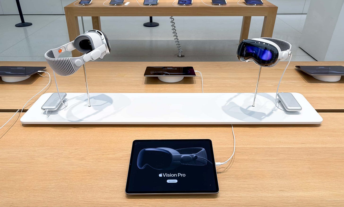
Five core fixtures complete the standard Vision Pro merchandising set at most U.S. Apple Stores today. The first is a new riser. The riser is a white plank similar to Apple Watch risers, but without a text label. At each end is one Vision Pro unit fit with a Solo Knit Band and mounted on a stainless steel pedestal. At its base, the power cable is spooled and attached to the battery pack. These units are attached to the riser and not meant to be picked up.
Six iPads running demo software line the table. The Explore app here is a bit different than the interface on Apple Watch display tables; Vision Pro features are outlined in large, horizontally scrolling tiles. There’s even a button in the upper right corner that displays a QR code to book an appointment. It’s slick.
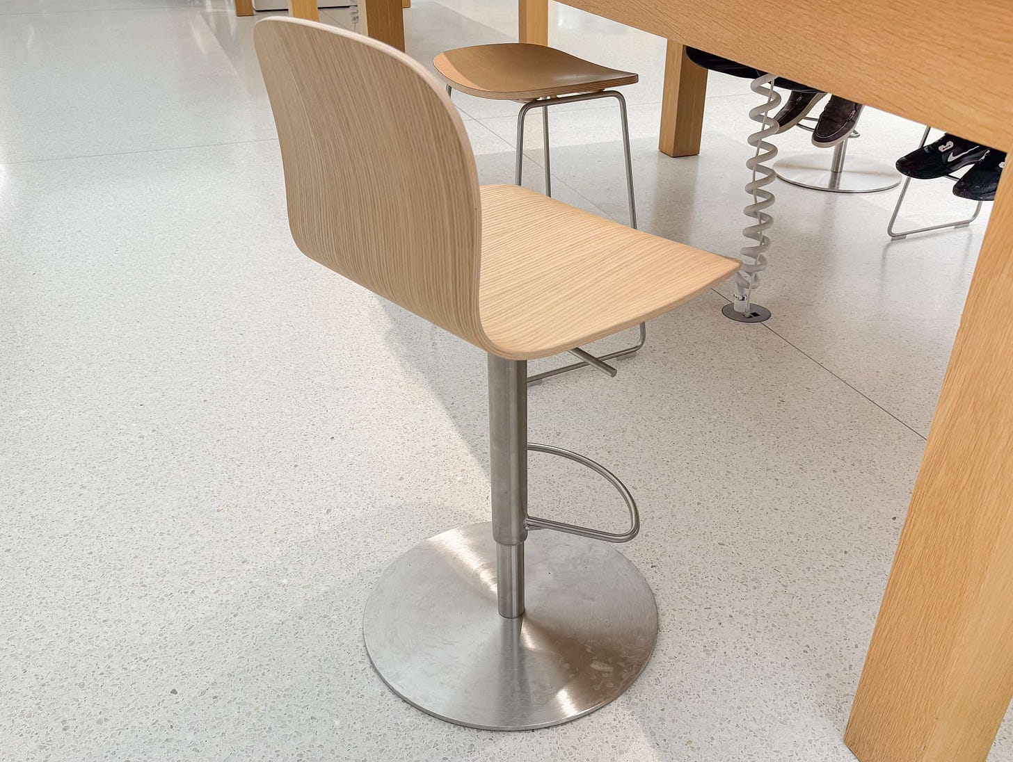
Two of the four Morrison Stools at each demo table have been replaced with new, significantly more comfortable stools suited for 30-minute appointments. The critical additions here are a backrest and footrest. You’ll want to relax while wearing Vision Pro. You might even jump at a particularly stunning 3D scene! I can imagine customers toppling backwards on the old stools.
Aside from the weight (they’re much heavier and more difficult to slide than the Morrison Stools), these new stools should probably be the default in every store, at least for Today at Apple. I haven’t been able to confirm the manufacturer yet, so I assume they are at least somewhat custom fixtures. The base has the same brushed finished as an easel, and the wood seat matches a new table. The design is very close to the HAL Ply Barstool from Vitra, a stool also designed by Jasper Morrison.
Apple Vision Pro is presented to you on a wood tray. This tray complements other trays you might find around an Apple Store, but its design is unique. The frame follows the curvature of the cover glass of Vision Pro, and the base is slightly elevated to make it easier to pick up. The interior of the tray is a bit concave to keep its contents from shifting about, and the lining is a soft, white material. A fully stocked tray contains an Apple Vision Pro with a Solo Knit Band, the power cable and battery, and a cover for the cover glass.
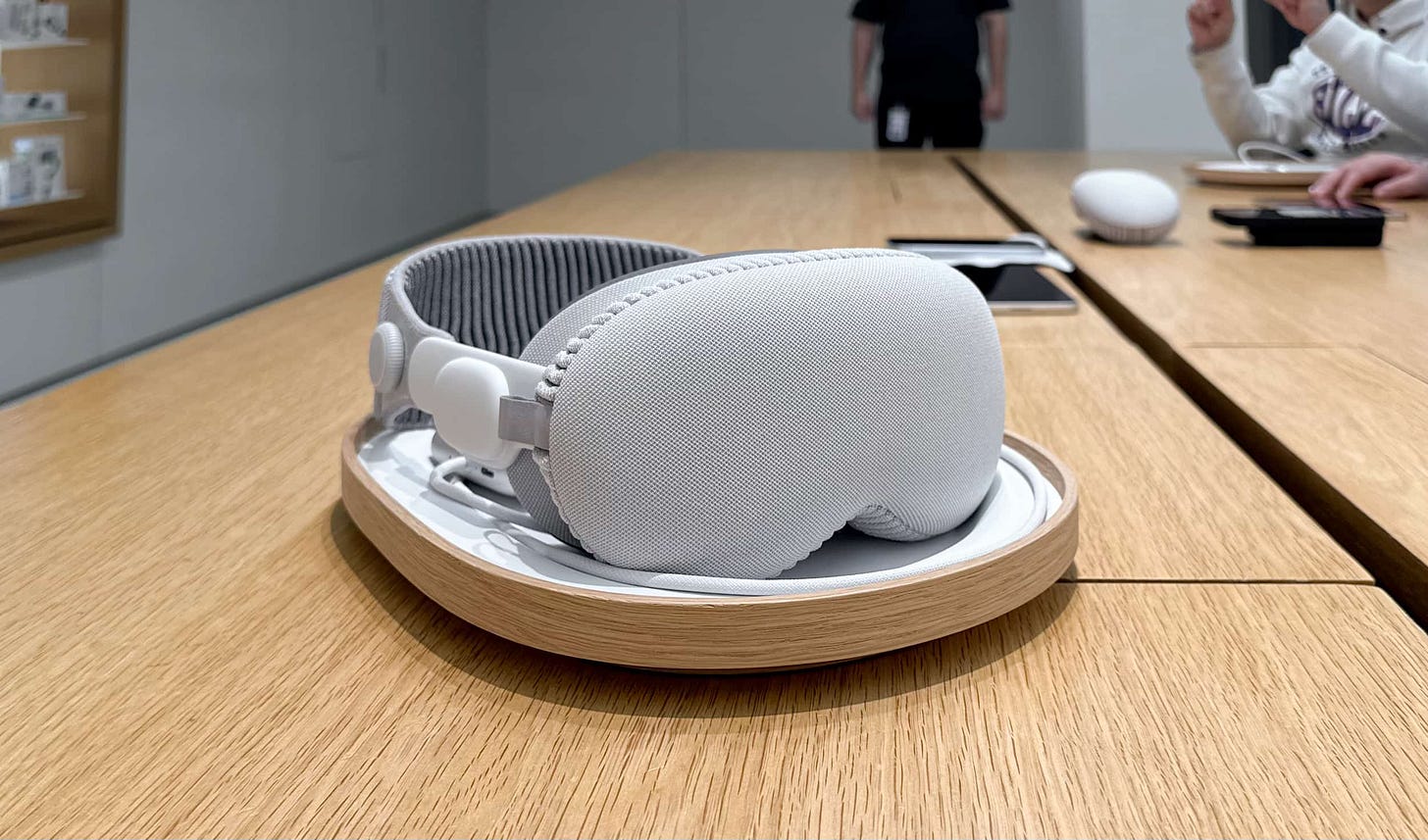
When you pick up the device from the tray, the Specialist will instruct you to hold it by the frame, not the Light Seal, and to guide it over your head band-first. If you set the device down on the cover glass, they will gently place it back in the tray properly every time. There are no exceptions. You are asked to remain seated and parallel to the table at all times.
Then there’s the cabinet. In each store, one demo table is capped by a small cabinet on the far, short end. When this cabinet began appearing early in stores across the country, it was universally panned on social media. I don’t think it’s a perfect fixture, but I also don’t think it’s deserving of so much uncritical contempt.
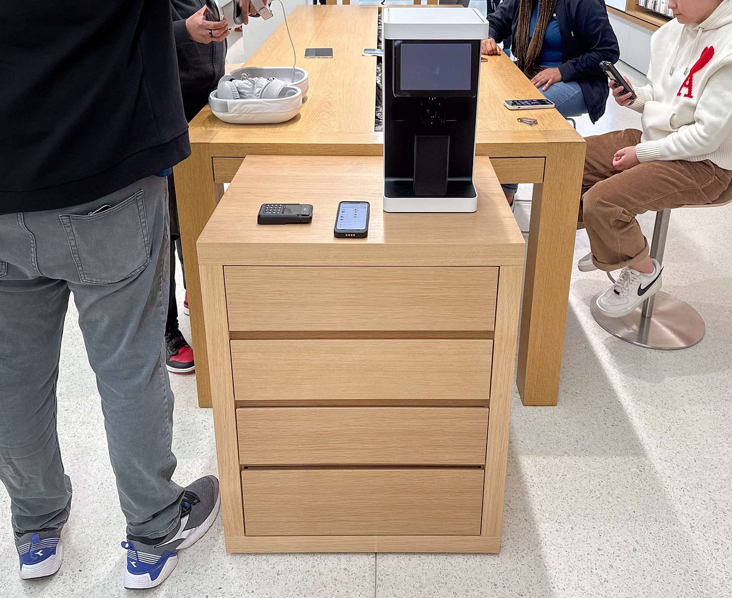
The cabinet contains sliding drawers filled with small wood dividers designed to fit extra Vision Pro accessories, like Light Seals. This eases the demands put on store employees by eliminating extra trips to Backstage.
The chief complaint online about the cabinet, which is officially a “Parsons Cabinet,” is that the fixture is 32.75 inches tall, with a small air gap underneath, and store tables are 34 inches tall. That discrepancy results in a tiny ledge between the tabletop and cabinet instead of one smooth, continuous surface.
When you see a fixture in an Apple Store, you can be sure that it’s only appeared there after countless hours of research, thought, and consideration by some of the brightest minds in retail design. That’s why I’m fairly confident there’s a good reason for the unusual height of this cabinet, though I haven’t quite figured out what it is. I do have some theories.
If one were to make the cabinet the same height as the table, it would effectively become an extension of the table, not a distinct fixture. As it stands, the cabinet top is to only house the machine for scanning lens prescriptions. On the other hand, if one were to make the cabinet the same height as the table minus the tabletop, it could slide neatly under the table edge. Visually, this would be great. Practically, you’d lose a surface for the lens machine and leg room for the customers trying Apple Vision Pro at that table.
The other complaint about the cabinet is that the wood doesn’t match store tables. This is technically true — the cabinet wood is much lighter than the tables at most stores — but that’s only because the tables eventually develop a darker patina from dirt, skin oils, and the environment. This is rarely noticeable because all of the tables in a store are typically the same age, and replacement fixtures rarely touch. In addition to the white oak cabinets found in most stores, some older stores hanging on to their busted old classic tables have matching maple cabinets.
My critique of the cabinet is simply that it adds visual clutter and makes the store less accessible for wheelchair customers by narrowing the aisle. Wide aisles are a hallmark of the more accessible Vintage D.2 and E designs, and it’s unfortunate that this fixture undermines that work. I don’t have a better solution to suggest here, I’m simply acknowledging reality. The cabinet is clearly an essential element of the Vision Pro merchandising strategy, but stores were clearly not designed to anticipate it.
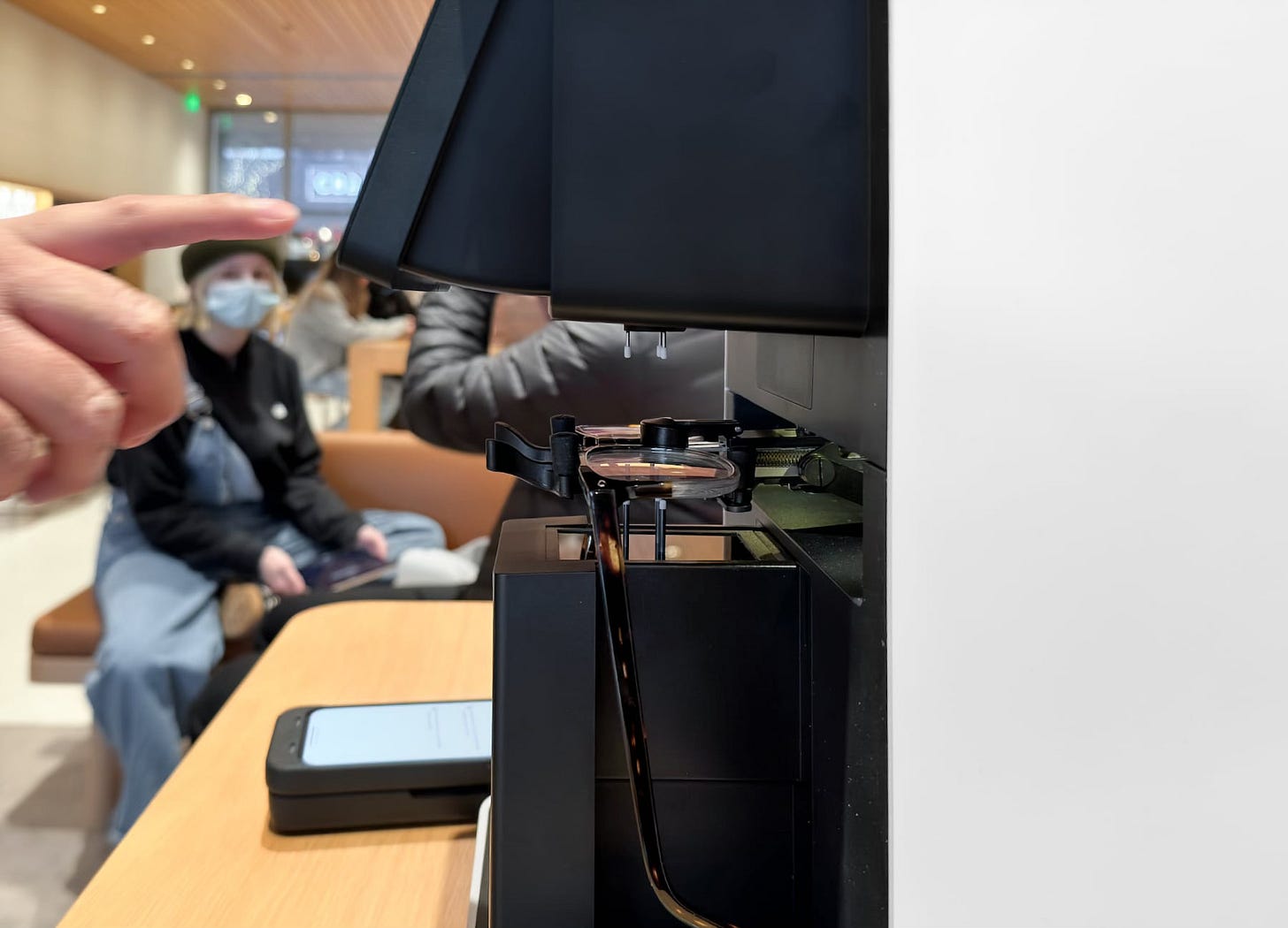
On top of the cabinet is the aforementioned lens scanning machine. It looks a bit like a Keurig, but it only brews up QR codes. Scroll down in this article for a great video of the patented machine in action. The Specialist places a pair of glasses in the holder and begins a measurement. First the left lens is scanned, then the right. When the measurement is complete, a QR code is displayed that an employee can scan to find the right ZEISS Optical Inserts. Your actual prescription is not revealed.
The process feels a bit like magic to me, but it’s completely essential for this machine to exist if the in-store demo experience is to work at all. Walk-in customers can’t be expected to have their glasses prescription on them. Without the scanner, many people would leave unhappy. Even today, not all prescriptions are supported.
Into the Demo Zone
If all this excitement wasn’t enough, Apple decided to crank it up a notch at select stores. There are too many photos to share here, so click the links in this section if you’d like to see more.
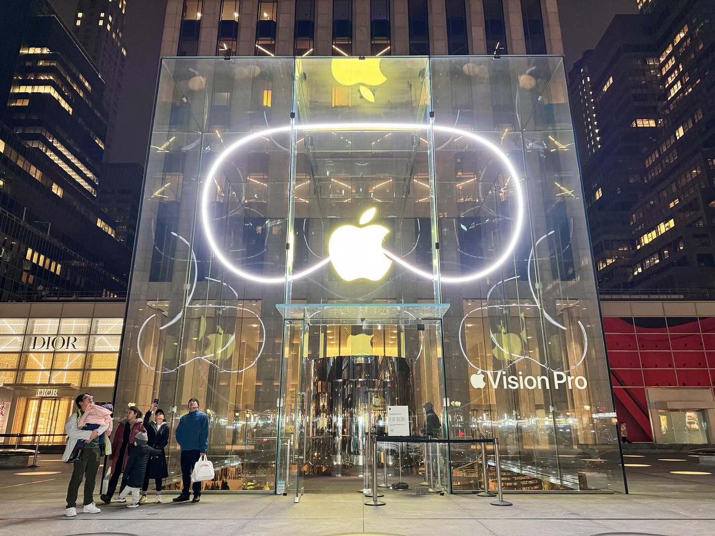
At three favorite stores — Fifth Avenue, The Grove, and Apple Park Visitor Center — Vision Pro outline window displays were created in addition to the vinyl decals on the windows at every store. You’ve undoubtedly seen Fifth Avenue, with its massive, cube-filling outline. At Apple Park Visitor Center, two glowing Vision Pro frames sit atop a floor stand. At The Grove, the displays float in the windows and almost appear to be powered by magic.
At just over 40 stores (as far as I’m aware), Apple designed, built, and installed beautiful Demo Zones to create an elevated experience. It’s important to note that while these zones are more comfortable and fun to visit, the actual demo content is consistent across all locations. Don’t feel bad if your local store isn’t in the zone.
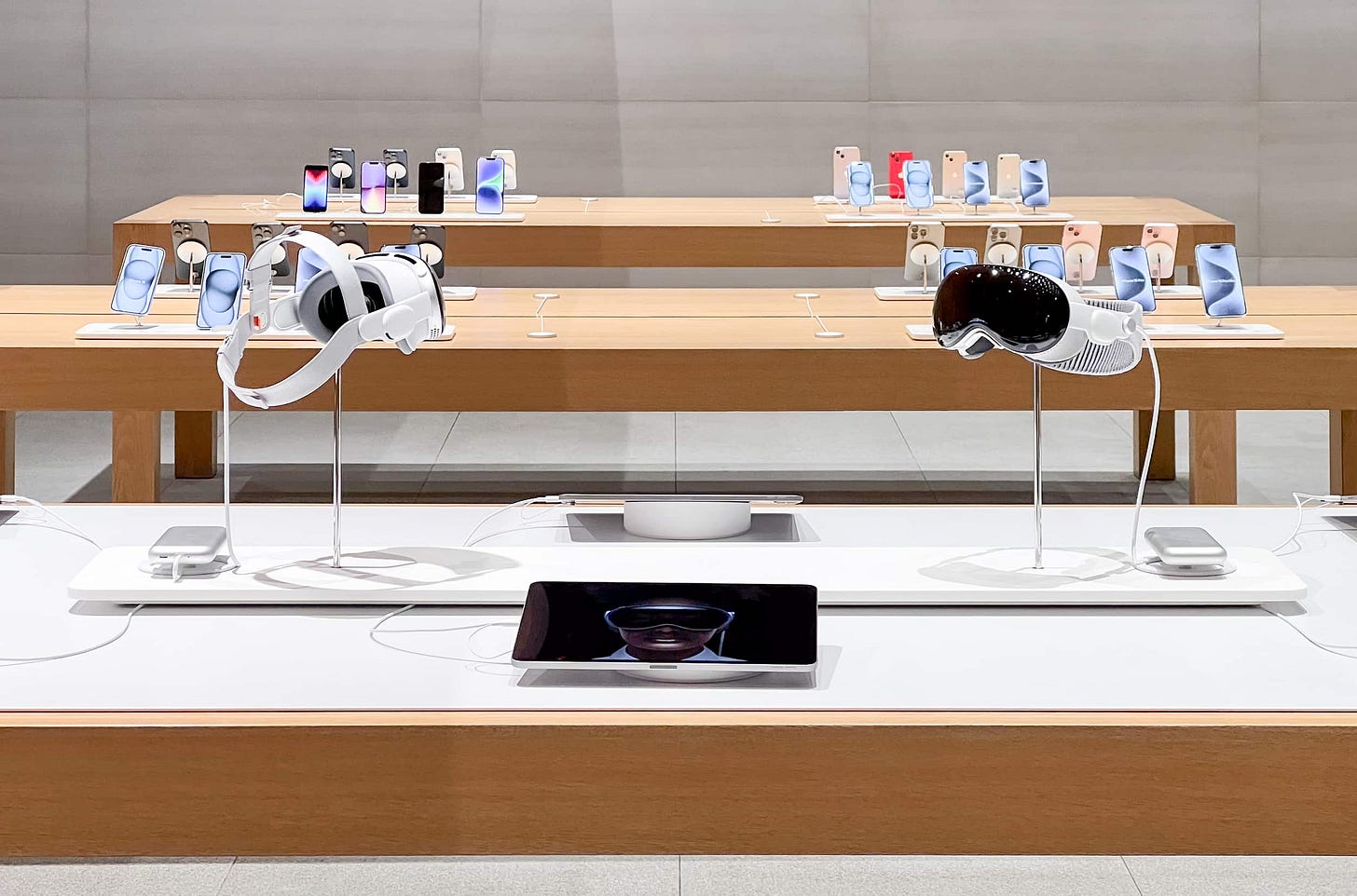
With one exception (which we’ll get to), all Demo Zone stores begin with new Spotlight Tables. You might remember Spotlight Tables from last September’s iPhone launch. Each table is first outfit with a white mat, on top of which are placed Vision Pro risers and iPads. A Spotlight Table accommodates one or two risers each holding two demo units, but longer tables can fit even more.
Unlike last fall’s Spotlight Tables, the white mats for Vision Pro have rounded corners, are thinner, and don’t extend to the edge of the table. But of course, there are exceptions. At at least two stores — Fifth Avenue and The Grove — the table design mirrors the iPhone 15 launch from last fall, with roughly half-inch-thick white slabs covering the entire tabletop. At these stores, risers are omitted, and the Vision Pro units are anchored into the table. The table space at Fifth Avenue and The Grove also allows Apple to display both the Solo Knit and Dual Loop bands.

Next is the seating. If you’re in a rush, this great video from CNET will give you a good high-level overview of the Demo Zone. We’re going to go a bit deeper.
The Demo Zone is a new store area specifically designed to accommodate Vision Pro appointments. Apple has developed a totally new furniture set for the Demo Zone that matches existing store architecture and fixture quality. These aren’t cheap, throwaway couches and cabinets for a temporary display, they’re made of the same high-quality materials you know from stores around the world. I have to imagine Apple has a long-term plan for this furniture.
A standard Demo Zone fits in the space of two service and learning tables and begins with a light taupe rug with rounded corners. The corner radius of the rug hugs the corner radius of the four padded sofas outlining the zone. Since Apple no longer uses leather in new products, I’m inclined to believe this furniture is upholstered with faux leather.
Customers gather around the Demo Zone like a campfire. Each sofa can host one demo appointment at the time. The customer and Specialist are seated on opposite sides of a small wood tray anchored in the center of the sofa. This tray mirrors the shape of a Vision Pro tray and is mounted on a track that slides back and forth.

Between the sofas on opposite ends of the Demo Zone sit two cabinets that are identical to the Parsons Cabinets installed at every store, aside from rounded corners. One cabinet is assigned to the lens scanning machine.
Because no two stores are identical, Demo Zones vary. Stores with those old maple tables have maple sofas and cabinets. Larger locations like Fifth Avenue and The Grove have multiple zones. Again, there are exceptions.
Both Apple Carnegie Library and Fifth Avenue have original Experience Rooms, but neither store is using theirs for the Demo Zone. Presumably this is because the rooms are too small or too hidden for a launch this big. Apple Tower Theatre doesn’t have a proper Demo Zone, but demos are being hosted in the luxurious theater seats in the balcony. Functionally, this might be even better.
Some stores with a visible Boardroom like Apple Valley Fair have adapted the quieter space for a demo environment. The Hiroshima armchairs that typically line the Boardroom table have been replaced with what appear to be armless Hiroshima chairs.
So far, I’ve located 38 Demo Zone stores, most of which I’ve linked photos from below. If you grab photos from a location I’m missing, please send them my way!
Apple Park Visitor Center, Williamsburg, Carnegie Library, New Haven, Highland Village, Grand Central, Dadeland, Lincoln Park, Ridge Hill, West 14th Street, Domain NORTHSIDE, Boylston Street, Irvine Spectrum Center, NorthPark Center, Manhattan Village, Fifth Avenue, Victoria Gardens, Aventura, Pioneer Place, Union Square, Ala Moana, University Village, King of Prussia, Third Street Promenade, The Grove, Southpoint, Cherry Creek, Short Hills, Fashion Valley, Valley Fair, Michigan Avenue, SoHo, Scottsdale Fashion Square, International Plaza, Mall of America, Lenox Square, Palo Alto, and Tysons Corner.
Tysons Corner
Oh yeah. Then there’s Tysons Corner. Apple Tysons Corner doesn’t have a Spotlight Table; it has something even more special. The Experience Room, once home to Apple Watch Studio, has been transformed into so much more than a deep avenue.
The center Avenue bay holds Vision Pro accessories, and a display with curved corners loops the type of clips you’d see on a video wall. Both smaller, 5-foot bays are backed with vertical, textured wood panels and offer accessory storage and counter space for the lens scanning machine. The counter in the center of the Experience Room has been shortened and fit with a Vision Pro riser. The center column contains more drawers for extra storage.
Sofas fill both corners of the space. These sofas are a bit longer than those in other Demos Zones because they aren’t interrupted by a cabinet. To make the demo more comfortable, room dividers made of vertical wood louvers provide a bit of privacy.
The Experience Room looks absolutely phenomenal. It reminds me of the beautiful Moynihan Train Hall lounge or a posh cocktail bar. I’m reminded of what I wrote when Apple MixC Wenzhou opened:
It’s striking that Apple’s “best” stores in America, Europe, and Asia are currently smaller locations trapped inside enclosed shopping malls. It’s not clear to me how or if Apple plans to consistently move these new features to existing stores. When Vision Pro eventually comes to China, for example, will a lone mall in Wenzhou offer a better try-on experience than the spectacular, newly-renovated Apple Pudong in Shanghai? Will shopping for Apple Watch bands always be better in suburban Virginia than on Fifth Avenue in Manhattan?
We’re beginning to see this play out. Apple Fifth Avenue might be larger, but I think it’s hard to argue that any store has a better Vision Pro Demo Zone than Tysons Corner. It feels like the retail design teams are moving at the speed of light, but budgets and logistics just can’t keep up.
You can’t launch a platform twice. Apple had one shot to get the Vision Pro demo experience right. They nailed it. People aren’t just talking about the device, they’re talking about just how good the demo is. How essential it is to understanding spatial computing. This is Apple Retail at its finest.



thank you, brilliant capture of the CX