The all-new Apple Square One opened on March 23 at 10 a.m. in Mississauga, Ontario. Previously one of the oldest stores in the Toronto area, the new location is now one of Apple’s most impressive in all of Ontario.
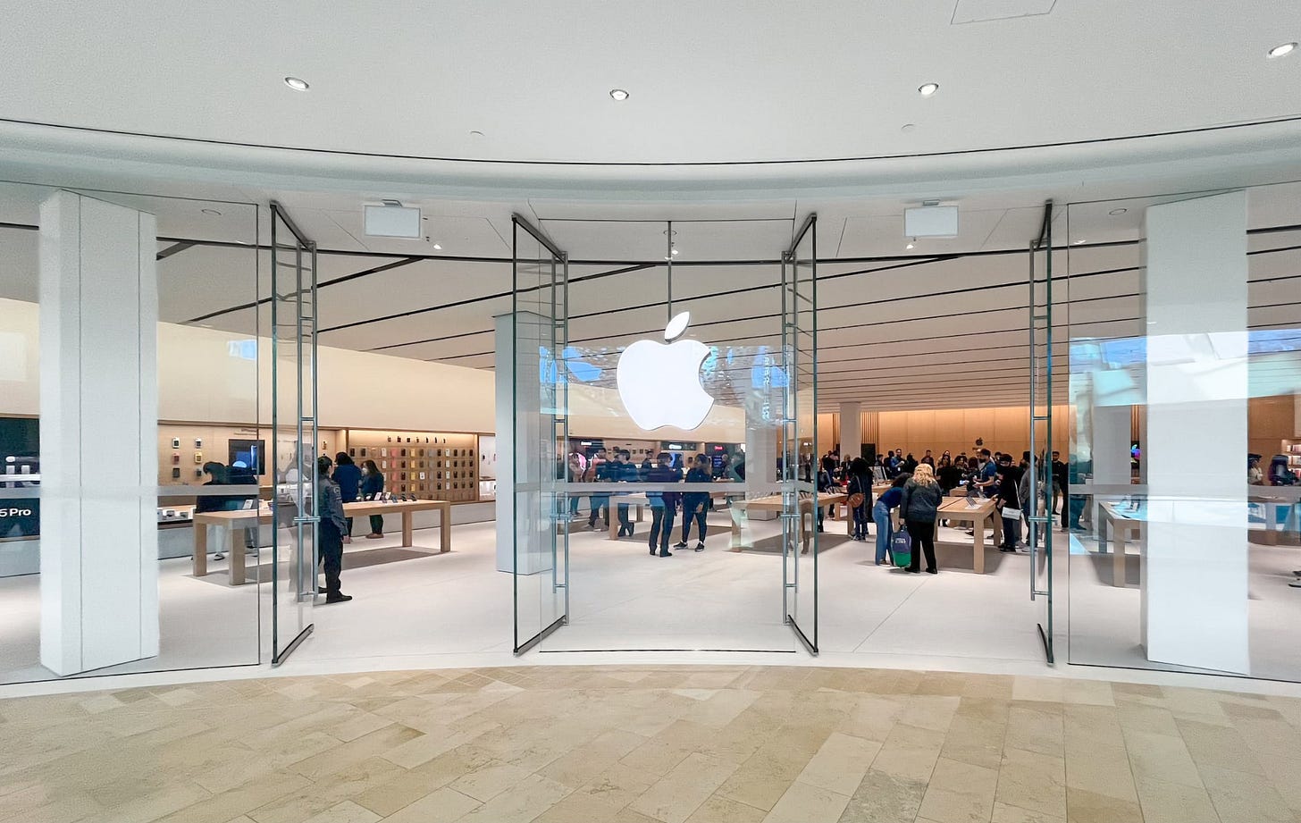
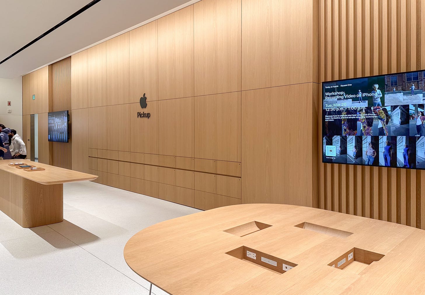
Apple Square One is the first location in Canada with an Apple Pickup counter, stationed at the wood back wall. It’s also the first store in the country with the Vintage D.2 design. There are a few unique details here.
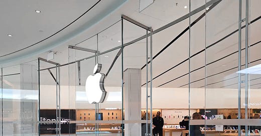
To date, indoor stores with this design style save for Apple White City and MixC Shenzhen have a storefront entry fit with sliding glass doors. Apple Square One has two sets of swing doors hugging the Apple logo.
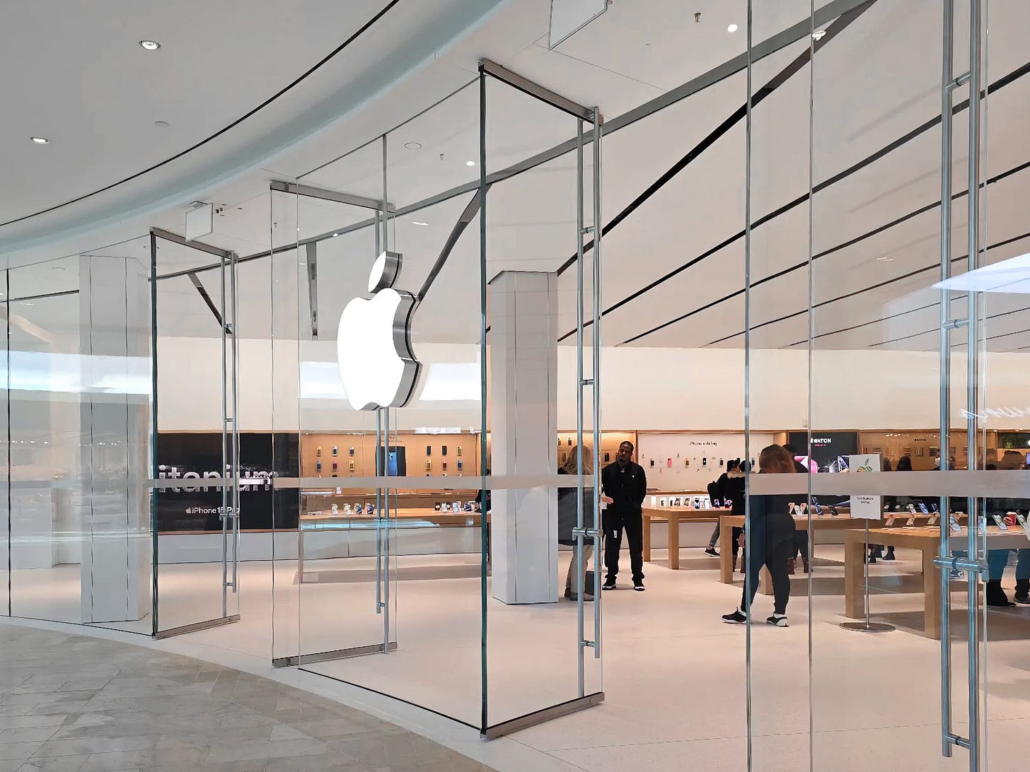
These doors rotate about a point offset from the edge of the panel, giving them the appearance of quasi-Pivot Doors. Owing to their resemblance are the ceiling height door pulls and brushed trim, both of which give the doors more pronounced frames.
Inside, Apple Square One has an impressive 85 feet of Avenues along the left wall and 60 feet along the right. The space is six tables wide and three tables deep, with one extra table at the leftmost front of the store.
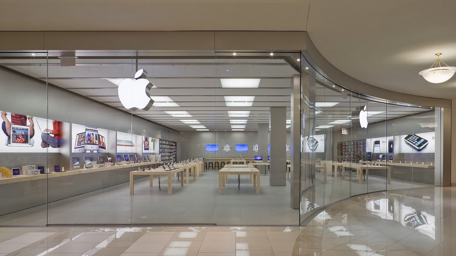
One of my favorite pastimes is finding design through lines that span decades. I couldn’t help but notice the striking similarities between Apple Square One and the second iteration of Florida’s Apple Aventura, which existed from September 2008 to August 2019.
Both stores follow essentially the same template: an inwardly-curved, asymmetric storefront with a longer left wall and a shorter right wall. The focal point of both stores, the back wall, sits at approximately a 45-degree angle in relation to the main entry. What’s remarkable here is that the layout guidelines and fundamental principles that shape Apple Retail are flexible and universal enough to span 16 years, a dramatically new material palette, and an entirely redesigned product lineup.
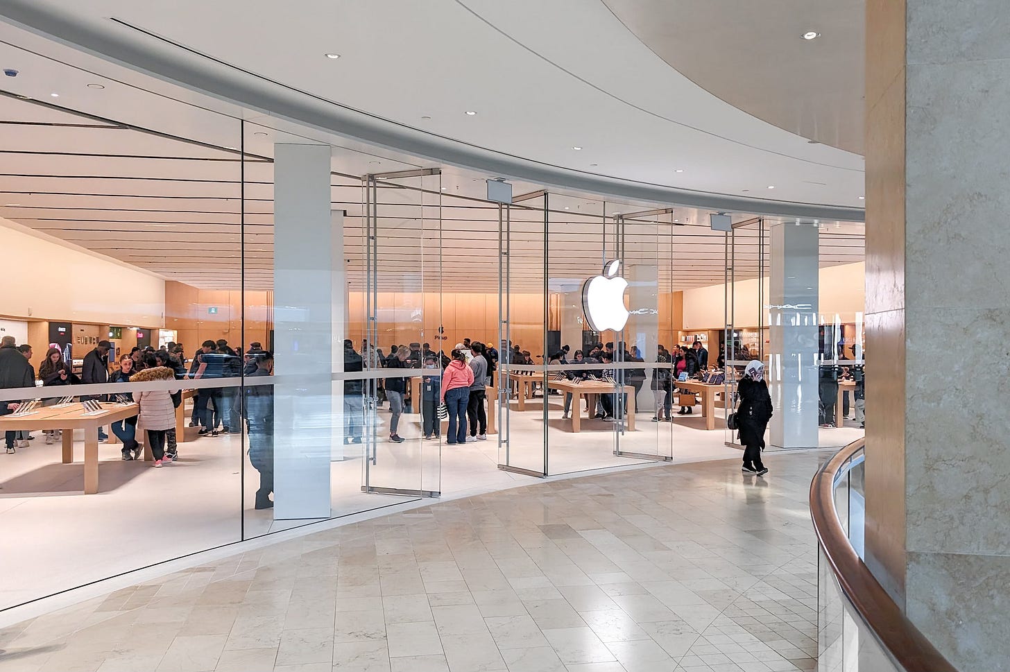
I’m impressed by this upgrade, and it’s great to see a store up north get some attention. The majority of the Canadian fleet has changed little in the past decade, and the last major move was Apple Pacific Centre in 2022.
To see a (brief) video tour of the new Apple Square One, check out this Instagram reel published by the mall and this behind the scenes clip detailing how it was made.
Almost there
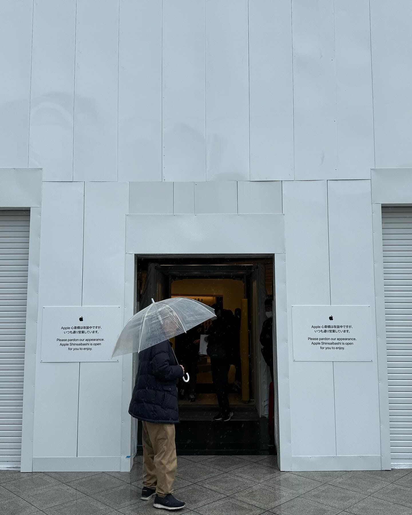
Last week I told you that renovations at Apple Shinsaibashi had wrapped up. I’ve learned this wasn’t entirely true. Interior work on the sales floor is finished, but the store’s entry is now under construction. It remains to be seen if this will result in a full facade reconstruction. Stay tuned.
Featured image
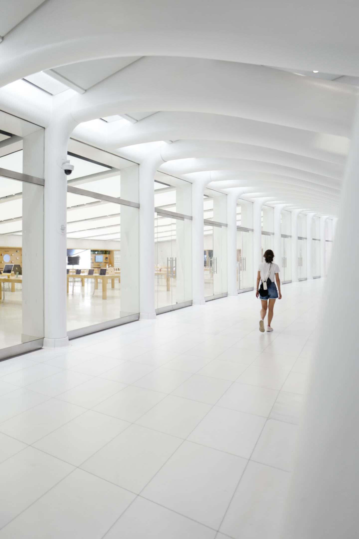
Apple World Trade Center
Photo via @uniwave.


Mr. Steeber, I work at an Apple retail location in New Jersey. I think your blog and apps are a treasure and a real resource. Thanks and keep up the good work!
Just wanted to say, something about the photo of the Aventura location alongside the Square One photos opened up a sense memory for me. I was brought back to some of my first times as a kid visiting an Apple Store and feeling this visceral sense of possibility, discovery, and creation that existed in those stores. I think as the company grew and the stores became more about high end produts (was that the Angela Arendt's era?) some of that feeling got lost in the stores. But it looks like with these newer designs there is almost an intention to bring back those sensations. I think that comes from, as you said, a throughput in the design language that spans 16 years. Anyway, awesome newsletter, I subscribe to be hit with those nostalgic sense-memories, so thank you for that!